Since the NFL partnered with NIKE it wasn’t if but when many teams would update their uniforms. This offseason three teams have updated their logos and uniforms in order to look good for the cameras for the 2013 NFL season. Here’s how I rated the newest looks in the NFL from worst to first!

Mike Wallace shows off his new threads
The Miami Dolphins: Well I never thought I’d say this but I miss the old dolphin logo. With a new “modern Miami” logo, apparently they’re having dinner with the Marlins brass, the Dolphins have the worst of the new uniforms. While they earn points for no orange uniform I don’t like the new color scheme. the Blue and orange worked very well together, however the new uniforms have reduced the orange to just a minor accent color instead focusing primarily on the teal and a darker shade of blue. While cleaner looking, these uniforms lack the charm and individuality of the previous and tried a little to hard to be both modern and traditional. You have to either go traditional or modern, you can’t do both. Unfortunately these uniforms while sleeker don’t represent the history of the Dolphins like the old ones did.

Going back to the purple people eaters.
Minnesota Vikings: And I thought Adrian Peterson looked tough before. While the Vikings also updated their logo, although it’s practically impossible to tell, they decided to ditch their old uniforms which had way too much piping and colors to go old school. These bad boys go back to the darker shade of purple and ditch all of the noise of the previous incarnation to just be simple but pure. With the minor details such as the numbers looking like the bow of a ship, and the sweeping horn design on the shoulder, which will make All Day look even faster, the Vikings new uniforms hit the mark combining modern-day sleekness and the Vikings storied history
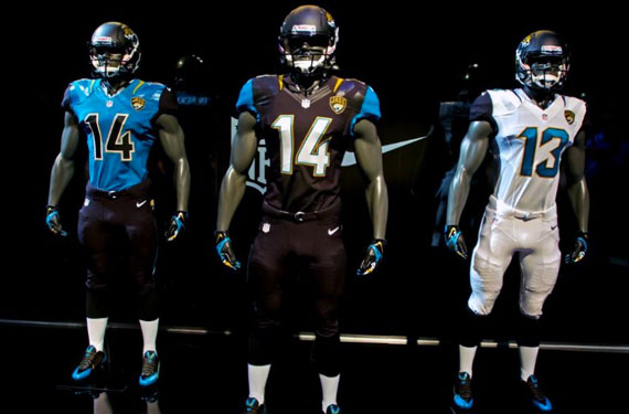
Hey they might be bad, but at least they look good!
Jacksonville Jaguars: Talk about making a statement. For years Jacksonville has been a bad football team. While this trend will probably continue at least they’ll look awesome doing it. The new logo is ferocious and intimidating and is the best revamped logo in the NFL. The helmets are ground breaking, fading from black in the front to gold in the back to look like a jaguar pattern. The Uniforms are sleek, stylish, and use the team colors of teal, black and gold very well. The new teal jersey looks great with the black numbers, shoulders, and pants since the black really pops with the gold outlining. The all white look is crisp and clean once again highlighting the teal with the black. However, my favorite are the all black bad boys. All black uniforms with teal and gold trim and the white numerals that really pop. It was great to see the Jags bring back the black 2 years ago but this uniform kicks it up a notch. Now at least playing for the Jaguars will mean players will get to wear one of the best uniforms in the NFL. Do you agree with the list? Comment below
