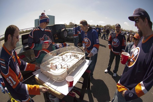
7: Pittsburgh Penguins

Why not bring back the powder blues?
For the Winter Classic the Penguins have been known to wear their old school powder blue uniforms or some combination of the powder blues. It was a surprise when they released a jersey with none of these elements for the Stadium Series game. True it may not be as important as the Winter Classic, but it would have been nice to see the Penguins in their old school blue jerseys. What makes it worse is that they just basically rolled out a watered down version of their current jerseys. The only change is the striping on the jerseys which is boring. If anything, they could have gone with the old black and yellow color palette instead of basically the same exact jersey colors they use all the time. With so many options for the Penguins, it was disappointing that this was the best they could come up with.
6: LA Kings

Grey and boring
Even though black and grey is a great color scheme, the Kings somehow screwed this up. Instead of doing a solid black jersey or bringing back the old Kings logo during the Gretzky era, the Kings just put out a grey jersey that looks like it should be a practice jersey. With weird LA should logos, the old crown logo, there just isn’t much to say about these uniforms. They’d have been better off with more black or going back to the old school purple and gold. The would have been awesome to see the purple and gold on the ice again.
5: New York Rangers

Really? Let’s just rip off the Hartford Wolf Pack
The Rangers Winter Classic is one of my favorite jerseys of all time. I had high hopes for the Stadium Series hoping they would bring back a cream colored jersey or another old school look. Instead, the Rangers created a new look that looks like a combination between their old 90s alternates and the Hartford Wolf Pack. Silver? Really? The silver makes no sense, I’d rather see cream than silver. If they were going in this direction, they should have brought back the old statue of liberty logo instead of the New York script across the chest. With better logos and colors, the Rangers struck out when it came to Stadium Series jerseys.
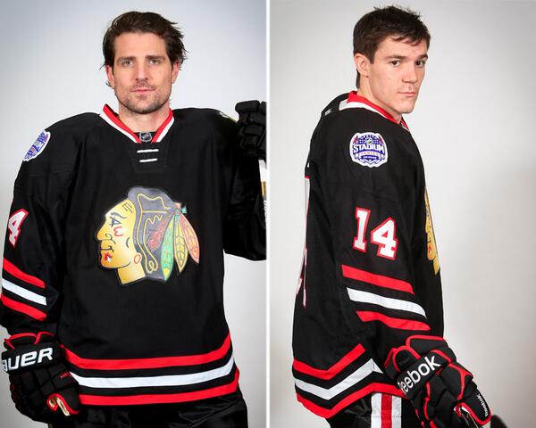
4 Chicago Blackhawks

Back in Black
The Blackhawks had the best Winter Classic jerseys with their classic logo and design. This year, the jerseys are good, but nothing special. It just feels like a lazy attempt. Just a basic black jersey with the current logo. Sure the black looks great with the red and black, but it would have been nice for the Blackhawks to bring back their old logo or jerseys. While it’s not the worst jersey, it’s by no stretch the best.
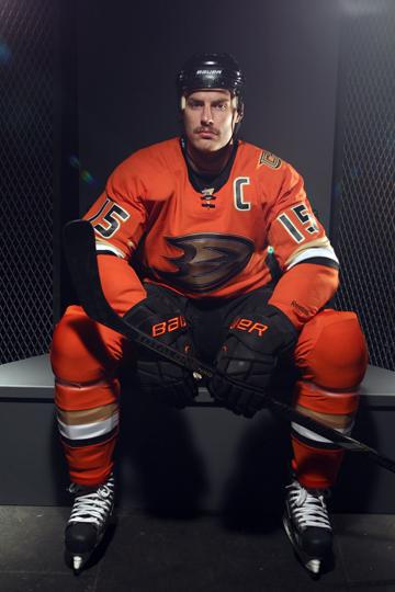
3: Anaheim Ducks

Orange is tough to pull off, but the Ducks do it well
These jerseys by the Anaheim Ducks are very good. I love the orange color which both pops, but at the same time isn’t obnoxious like some orange jerseys can be. The burnt orange color is something different that you never see in a uniform and looks great with the black, gold, and white trim. The reason this jersey isn’t higher is the logo. While the Giant webbed D is good, we’ve seen it before. True it’s better than the “Ducks” script jersey, but I would have like to see them use the old Mighty Ducks logo with the mask and interlocking sticks. I have always been begging the Ducks to bring back that logo and think that would have been a great time to bring it back. Had they used that logo, they could have been on the top of the list, but without it they stay at number three.
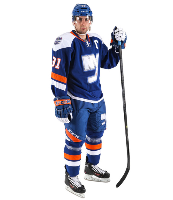
2: New York Islanders

Old school and new school meet for a great combination
Given the Islanders’ illustrious uniform history which includes some of the worst jersey disasters in hockey history, I was skeptical when it came to their Stadium Series jerseys. However, the Islanders jerseys are incredible and the one jersey in the Stadium Series that should become the team’s third uniform. This would be so much better than those stupid black jerseys the Islanders have. With the classic blue, orange, and white colors, this jerseys looks beautiful. Add in the horizontal stripes on the arms and pants, clean white shoulder stripes and this is an aesthitically pleasing jersey. Then the logo, finally a team that tried something new. I love how the Islanders incorporated the NY part of their logo with a modern twist on the chest. Overall this is a great jersey, and I hope the Islanders keep using these after the Stadium Series.
1: New Jersey Devils

A Classic
The Devils jersey may not be new or innovative, but it’s nice to see at least one team honor their heritage. Sure Christmas colors may not sound like a winning combination on a hockey sweater, but the Devils make it work. The red, white, and green is simple and beautiful. These jerseys pop with their red color scheme and the green and white highlights are crisp and mesh well together. Sure it may look like Christmas on ice, but who doesn’t love Christmas? Finally the Devils have one of the best logos in hockey, so why mess with perfection? Great logo, great jersey, clearly the winner. Do you agree or disagree? Which was the best Stadium Series jersey and which was the worst? Comment and like below!
 One of the biggest deals from the 2014 NHL trade deadline was the reunion on South Beach. No, it’s not Lebron James but Roberto Luongo, who will return to his former team, the Florida Panthers. While many Panthers fans may be excited about this reunion the real question is why? Why did the team make a deal that makes no sense? Sure Luongo is still an above average net minder, but it’s the least of the Panthers worries. The Florida is the second worst team in the Eastern Conference and well out of the playoff race. So why go after Luongo? It’s not like this team is in the playoff race and is a goaltender away from competing. Also given his recent decline, why not go after a younger net minder rather than a goaltender who could be on the back nine of his career? If anything this team should have moved another goaltender.
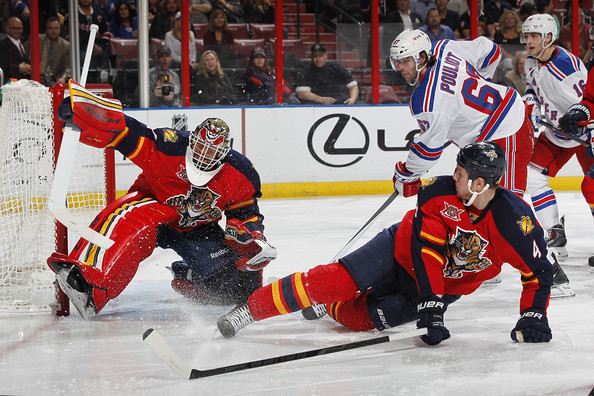 One of the few bright spots for Florida this season has been the play of Tim Thomas. With the team well out of playoff contention, the Panthers should have instead traded Thomas to a contender. Then they could have gotten some younger pieces while developing some of their younger goalies to see if they had anything. While goaltending is the most important position in hockey, the Panthers situation has gone from bad to worse. Now they have two declining goaltenders who want to start on a team that is going nowhere. Instead of reloading the bare cabinet, Florida has instead taken another step back from contention. Who knows? Maybe Luongo could regain his top-notch form in Florida and the Panthers could compete next year. However, with a great trade chip in Thomas, the Panthers failed to improve their depleted roster with the young talent to help turn the team around in the future.