Forget Broadway sports are the great unscripted drama. Sports are so popular today because they feature characters in an unscripted play with an unknown outcome. We have memorable characters that have been born through this drama, but what about the actual scripted sports stars? We forget that movies about sports have created memorable characters that become more nostalgic then the actual players. Hollywood and television has provided the backdrop for some memorable characters that stick out in our mind. But what if these characters were real? How much more entertaining and dramatic could it be if these fictional characters were actual facts. Here is a list of some of the most recognizable fictional athletes that fans would love or hate to see in the real world.
1) Ricky “Wild Thing” Vaughn: Major League 1&2

Wild Thing! you’d make our hearts sing!
Stylish hair check! Custom skull glasses check! 100 MPH heater check! Heart-throb to drive the ladies wild double-check!! Before Charlie Sheen was “winning” he was helping the city of Cleveland finally overcome their decades of futility in baseball. While the Indians still struggle in real life, if Ricky Vaughn was at the top of the rotation it would be a different story. From incarceration to the big leagues Vaughn got his nickname because of his terrible control problems. Like most rookies he struggles to find his place at the big league level until he puts on the specs and behold he can see!! By the end of the first movie he overcomes his control problems, and wild off the field antics to become the ace of the Cleveland staff. In Major League 2 he falls into the trap of most bad boy professional athletes and tries to clean up his act. While at first this seems like a good idea, eventually he realizes he must get his edge back and return as the “Wild Thing”. A baseball player with electric stuff, great looks, and bad boy attitude Ricky Vaughn would be constantly generating headlines with his antics while striking out the fiercest major leaguers. Not to mention he would be the heart-throb of the sport and lead to a hair-style phenomenom.
2) Kenny Powers: Eastbound and Down

He changed the face of baseball now he’s looking to do it again
Ah yes, the comeback story. Everyone loves a comeback story and Kenny Powers is no different. Once blessed with a 100MPH canon, Powers faded fast as his velocity dipped into the low 80s and his pro baseball career seemed over before it started. A substitute P.E. teacher making a comeback sounds far-fetched. Add in the egotistical, lazy, and angry sides of his personality and you have a powder keg ready for ignition. Success or failure just watching this train wreck comeback trail for Powers including pitching in the Mexican league with the American flag on his back would be worth the price of admission. Kenny Powers would be great just for the million dollar tweets that would fill his twitter account. Thew foul-mouthed ballplayer would without a doubt be on of the most followed athletes on twitter just for the simple fact you have no idea what this walking time bomb will do next. For you Kenny Powers fans click on the link for some of his best quotes because I can’t even put them on this page since their so raunchy. Powers would make a great hero or villain if he were a real ballplayer. Love or hate him one thing is for sure and that’s Kenny Powers doesn’t give a S&$% what you have to say.
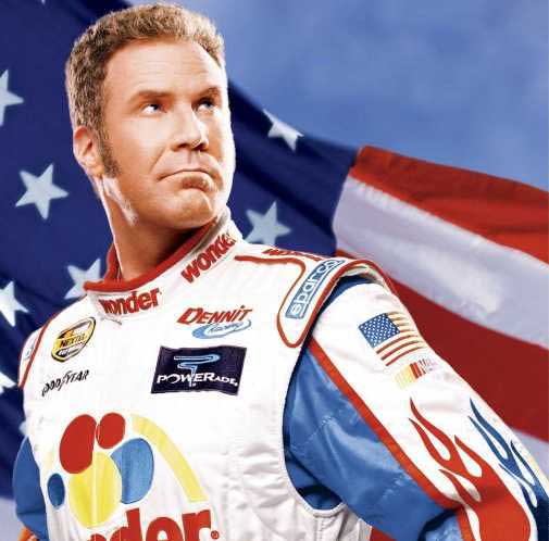
3) Ricky Bobby: Talladega Nights

He just wants to go fast
When Will Ferrel tackled NASCAR he created one of his most iconic characters. Ricky Bobby, a hotshot race car drive who “pisses excellence”, would bring fans flocking to the race tracks. His fast paced and aggressive racing style, memorable one liners, and catch phrase “if you ain’t first your last” would make him a racing icon. Not to mention the juicy controversies that the media would jump on such as flipping off other drivers while racing in reverse. Ricky would be a marketing icon from Big Red to Wonder Bread. Heck for a few extra bucks he’ll put your brand on the windshield. It may be dangerous but if he gets paid he doesn’t care. Throw in a comeback with him working his way back to the top you have the quintessential American athlete, which Bobby claims to be. Will Ferrell didn’t just leave his mark on one sport and shaked and baked another athlete on this list and that is……..
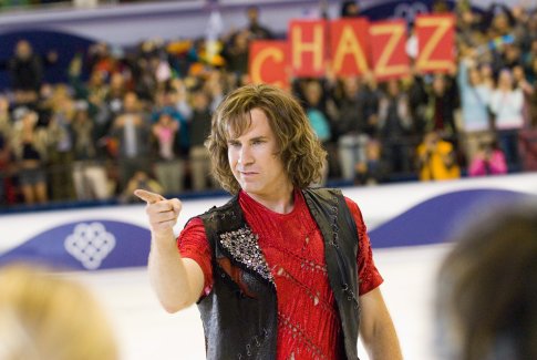
4) Chazz Michael Michaels: Blades of Glory

figure skating with an edge
Chazz Michael Michaels is figure skating Boom! Let’s face it who here really watches figure skating? Yeah me neither, but I would if this man was in it. Let’s see swagger, rock and roll playlists, not to mention the man shoots fire from his wrists. Don’t worry ladies he hasn’t forgotten about you too, talk about a heart-throb. On top of that he was one half of the first all men figure skating pair and was fire in the fire and ice routine. Throw in the scandal at the medal ceremony and getting banned from singles competition and you have a winner. Don’t forget some killer one liners like “I swear if you cut my head off I’ll kill you” and you have a whole new edge and image for figure skating. Plus we all know he is going to skate one song and song only!
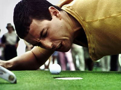
5) Happy Gilmore: Happy Gilmore

That ball may be to good for its home but the PGA would be a great home for Mr. Gilmore
Ah yes how many quotes can you pull off the top of your head when you think of this golfer. Ok, we all know golf is boring, but throw in Happy and you have a completely new ballgame. 400 yard drives, a hilariously bad short game, and a hobo caddy talk about your departure from the normal golfer. Can you just imagine if he was in a pair with Tiger? This hockey jersey wearing, foul mouthed, and goof ball antic golfer would make golf without a question more entertaining. He wrestles gators, beats up people, and not to mention threw hands with Bob Barker (see link)! Happy is also fighting to get his grandmother’s house back from foreclosure. How could you not want him to succeed? Happy would be an athlete that would entertain the masses whenever he picked up a club. Not to mention he makes us hate those clown heads at the miniature golf course too.
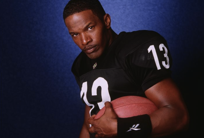
6) Willie “Steamin” Beamen: Any Given Sunday

From third string to star
While you could argue that Shark Lavay and Coach D’amato should be on this list here’s why Beamen beats them out. He goes from seventh round third stringer to starter. Hmm sounds familiar, oh yeah Mr. Tom Brady. He goes from having one of the worst first games you can have and even throws up on the field to using his freakish RGIII ability to tear apart defense and leads the Sharks to the Pantheon Cup. While the team falls short he would be ideal for our highlight obsessed society and would make football fans drool with his dazzling plays. Not to mention his good looks, battle to keep the starting job, and being an underdog make him an athlete who would thrive in the real world. He also could make a great villain since the movie ends with him signing a contract under the Sharks noses to leave with coach D’amato to go play with the Aztecs. Talk about pulling a Lebron James to South Beach oh the irony.
7) Thad Castle: Blue Mountain State

Thad don’t hit the quarterback in practice!
He’s a National Champion, thinks it’s B.S. that linebackers can’t win the Heisman, looks like “the freakin Hulk”, and hates all quarterbacks with a passion. Thad is the definition of a lovable idiot. While he may have rocks for brains there is no question that he can punish opposing offenses. Manti Te’o having an invisible girlfriend, Thad would probably laugh and tell you about all the girlfriends he’s had at BMS. Of course he did get suspended for using cocaine in his senior year and ended up missing one game. Despite his idiocy you cannot question his passion for football such as building a football field for the championship game when no field was available. Castle would be great as a real college and pro athlete. First he would a great villain for other college teams especially if BMS goes down for illegal scandals off the field. In the NFL he would be another great villain because of his constant trash talking and complete disregard for the rules. You’d love him if he’s on your team, but can’t stand him if’s he’s on any other team.
8) Rocky Balboa: Rocky Films

Rocky! Rocky! Rocky!
Ok we all know Rocky so this won’t be too long. If Rocky were real his accomplishments could have made him one of the greatest boxers of all time. Not to mention an endorsement icon for generations. While Rocky has had bumps in the road, Rocky 5, he is always able to overcome them and represents the true underdog. He would bring great publicity to a dying sport and would make boxing “cool” again. Plus when you add in an athlete he constantly flirts with retirement, albeit Brett Favre, then you have great drama. When is he coming? Should he come back? When should he retire? These would be questions ESPN would fall in love with and if you don’t think that they would fall in love with Rocky more than Mr. Favre then you would be wrong.
9) Roy Hobbs: The Natural

Comeback of the ages
Talk about your comeback. Roy Hobbs is a naturally blessed baseball player with unfathomable talent. At 18 he’d thrown 8 no-hitters in the minor leagues and struck out the “Hammer” the best player in the majors on three pitches. However, he gets cut down in his prime by a mysterious woman who shoots him. After years of recovering he returns to baseball as a 34-year-old rookie for the putrid New York Knights. However, he goes on a tear and guides them to the pennant while becoming the best player in the game. However, before the championship his old gun shot wound acts up and is told that he could die if he continues playing. However, (movie version) he is able to hit the winning home run and lead the Knights to victory. While this may mirror a current major leaguer, Josh Hamilton, Hobbs had to deal with a miser owner and bribes in order to throw the playoff games. Unlike Pete Rose Hobbs would stay the straight a narrow and represents the honesty that we would like to see in more athletes today. Plus a comeback of this magnitude would have people cheering because people always love the underdog.
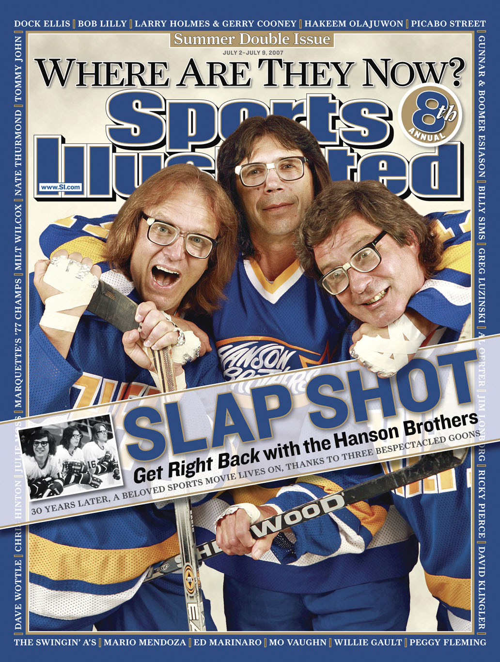
10) The Hanson Brothers: Slap Shot

This terrific trio would stir the pot in the NHL
Jack, Steve, and Jeff Hanson would be icons in real life. In the move Slap shot these three brothers were brought in to be the enforcers for the Charlestown Chiefs. Boy did they ever! Recognized by their crazy hair and taste in eyewear the Hanson Brothers quickly garnered a big following for being the goons of minor league hockey. This dastardly trio become known for starting fights even before the games. One such game had a brawl before the puck was even dropped. Not to mention their child like nature with playing with toy cars you couldn’t help but love them. Could you imagine them in the NHL? Fans would love if they were all on the same team fighting and enforcing. Not to mention the merchandising of those glasses would become a new fashion trend in the NHL. The Hanson’s would also garner criticism as the NHL is trying to clean up the game. Either way they would create a buzz and would have fans flocking to arenas to experience their antics. Especially if they were on a bad team that wasn’t going anywhere at least then the games would be entertaining.
Do you agree with the list? Any that you think I missed? Don’t forget to comment below and tell me what you think and what you would like me to write about next. To forget to follow my blog to get the latest from Rich Sports Talk and be able to email me on what you want to hear.