With the zombie craze sweeping the nation, it made me think what NHL jerseys should rise from the hockey graveyard and be worn again? While I am glad that most teams are going back to more traditional uniforms instead of crazy designs, I still think there are a few looks that should grace the ice once again. Here are five jerseys that the NHL should bring back right away.

While Buffalo has some classic jerseys, these were some intimidating threads
5) Buffalo Sabres- Ok Buffalo fans I know you’re not going to love this one but give me a second. I do love the current Sabres sweaters and I’m not saying they should be replaced, but I wouldn’t mind seeing the Sabres don these a few times a year. Come on they’re better than those “Buffalo” script jerseys. These jerseys had it all. The black, red, and silver created an intimidating sweater with a very good logo. Add in the cool shoulder logos with the saber and B and you had a great combination. This jersey also was the banner for a Stanley Cup final team, and would give the Sabres a great intimidation factor when these were put on.

The Stars have had a mess of uniforms. It’s time to go back to the basics.
4) Minnesota North Stars- With the mess of Dallas Stars jerseys over the past decade, including their new threads, maybe they should go back in time. Adopt the green, white, and yellow color scheme of old. Instead of being the “N” for North Stars maybe they could do an “S” or “D” with the yellow star. Hey no one has this color scheme in the NHL right now, and it would be a vast improvement over their new ugly sweaters.

It’s time to bring back a Canadian icon
3) Winnipeg Jets- The new Jets uniforms are incredible. However, they don’t have an alternate uniform. Instead of trying something new, why not wear the classic Jets jerseys. The combo of red, white, and blue is well-balanced. The old Jets logo with the hockey stick inserted into the script in front of the white background really pops. Hey this was a great jersey back in the day. Why not bring this back and bring back nostalgia for those older fans who had the original Jets in Winnipeg.
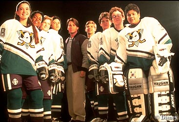
This jersey was the best jersey with the Ducks, maybe keep the jersey but adjust color scheme
2) Mighty Ducks- Boy these were classic. Hey they might have come from a movie, but the white Mighty Ducks uniform with the purple and green was awesome. Add in a cool logo and these jerseys were fantastic. Here’s what I’m purposing. The new Mighty Ducks uniforms look terrible with the Ducks script or the “D” web foot logo on the chest. Instead keep the color scheme of black, gold, and orange in the third jersey and insert the old logo. Hey A black jersey with the orange and gold highlights would make this logo really pop and bring back the best logo in the club’s history while maintaining their new colors.

Black and silver look great, but purple and gold would give the Kings a distinctive look
1) L.A. Kings- While I do love the kings colors of black and silver there is one problem. How many teams now have black in their color palette? A lot. However, no one has a gold and purple color scheme. Hey this was their original look, and would look great alongside their L.A. counterparts, the Lakers. There is something about purple and gold that just evokes royalty, and sophistication. With so many teams having black now incorporated, wouldn’t it be a fresh take if the Kings wore something unique that made them stand out? The Kings would have a look that no one else in the NHL could copy or duplicate. Plus, this crown logo is probably the best they’ve had. Hey, it’s tinsel town, shouldn’t gold be a color for all the glitz and glamour in L.A.? All I know is that I’d love to see the Kings bring these jerseys out of retirement, and bring some L.A. flavor back to the NHL.