Fans designing the uniform? Either genius or a disaster waiting to happen
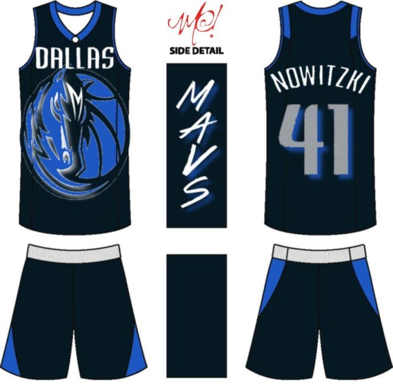
The Dallas Cowboys have one of the most iconic sports uniforms in history. From the white jerseys, to the iconic navy star on the helmet, the Cowboys logo and uniform are as recognizable as Coca Cola. Unfortunately, while the Cowboys may have one of the best uniforms and logo in sports, the other Dallas teams don’t provide the same nostalgia. The Mavericks and Stars are updating their looks for the 2013 season. First, renegade NBA owner Mark Cuban is once again thinking outside the box. Rather then hire a professional design team, Cuban has announced that the fans will have the chance to redesign the logo and uniform in a fan contest. While this does give the team great publicity, along with increasing the relationship between the fans and the team, it also could be a publicity stunt that goes horribly wrong. But seriously though do you really want some twelve-year-old with crayons designing your pro team’s uniforms? To see what the fans have come up with so far check it out (here). However, there is still hope that the Mavs could have some pretty awesome uniforms, however the same cannot be said for their NHL counterparts. The Dallas stars have had
Houston we have a problem
an identity crisis for a few years now. After years of uniforms that just read “Dallas” in a boring script, when it was announced that Stars would get their long-awaited makeover people rejoiced! Then when the jerseys made their debut fans were seeing stars, and not in the good way. Rather then tweak their intimidating black and dark greens uniforms, the Stars decided to ripoff of the old Hartford Whalers. Seriously call Gary Bettman these uniforms were stolen! Seriously the lighter green, and a black that suspiciously looks navy, I think the Whalers were robbed. While the uniforms might have been ok, the logo just kills these uniforms. You thought Dallas would have learned from their infamous constellation uniform disaster, but unfortunately the new logo is terrible. A giant D with a simple star? Really? These uniforms are disappointing. This is just another attempt of what I call “modern retro”, when a team tries to make themselves have a classic look, when they don’t have that classic look. While some Stars fans may like the change, personally I hate these uniforms. I think the Stars have a major identity crisis and these new uniforms aren’t helping. What do you think about the Stars new uniforms? Take the poll to vote for your favorite.
