Stormy Relationship: NY Islanders Reportedly Want out of Brooklyn

St Louis Blues v New York Islanders

It wasn’t if, but when the New York Islanders realized their crucial mistake of moving to the Barclays Center in Brooklyn. Not even one full season in Brooklyn, it has been reported that both the Islanders and the Barclays Center are looking for a way out of the team’s 25 year lease with the building. To say that the move to Brooklyn has been to a disaster is a huge understatement.

The Islanders were enticed by the vixen that was the Barclays Center. A sparkling arena in Brooklyn that would make the decaying Nassau Coliseum a bad memory when older Islander fans would tell younger generations that the team used to play in a dump. Unfortunately, New York fell for the perfect partner before the first date. Had the team and Barclays Center actually really looked into their future relationship, their status wouldn’t currently read: it’s complicated.

It looked good on paper. A sparkling new arena not too far from Nassau Coliseum that had

islanders-barclays-center.jpg

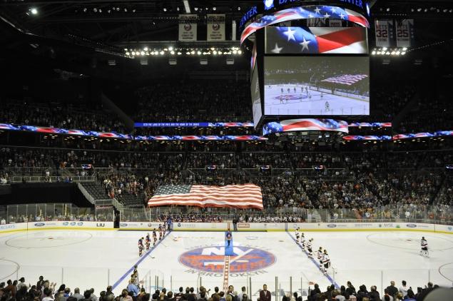
The Layout of the Barclay’s Center has created obstructed views, bad sight lines, and the smallest capacity in the NHL 

been established a new new center for entertainment in New York City. Then, the truth comes out. The arena has the worst sight lines in hockey with numerous obstructed views, and the smallest seating capacity in the NHL. The real kicker is that the Barclays Center limits the Islanders because under the agreement the arena collects revenue from ticket sales, advertising, and promotions. That limits the amount of money the team can make in the building and could stunt the franchises growth because of the lack of income.

The Barclays Center has also been hampered by the Islanders becoming a permanent tenant. Since they have to book the Islanders home games, the arena is limited in the concerts that can come to Brooklyn. Given the the primary purpose for the arena’s construction was for concerts and basketball, the Islanders are hurting the prospective revenue that could be made off of concerts.

It’s been a disaster from day one. The way Islander fans were ignored by the monopolized home of the Nets, the small capacity, axing of long standing traditions, horrible sight lines, exorbitantly high ticket prices, and a move

i23s-1-web.jpg

The new Islanders ownership is now stuck between a rock and a hard place.

that should have been a temporary solution at best, rather then a permanent home. Despite owning one of the best home records in the NHL, the attendance for the Islanders is  28th in the league. While part of that can be partially attributed to the smaller arena, the arena’s location, and ticket prices are what have impacted this standing the most.

So what now? There’s no promising solution for the Islanders on the horizon. While Nassau Coliseum is being renovated, the capacity will be 13,000, well below the the NHL minimum. There could be a renegotiation between both sides to work out a new lease, but this would be more of a patch then a long-term solution.

New owner Jonathan Ledecky has wanted to move the team to Queens in the past, but that would be an expensive proposition considering the Barclays Center cost a Billion dollars to build and the new Islanders arena would directly have to compete with it.

Either way both party’s have a terrible situation with no great exit strategy. In a perfect world the Islanders could build a new arena and leave, but given the current financial standing of the club, and the cost of building an arena in the New York area make that an almost impossible scenario. As long as the Islanders are in Brooklyn, an arena that’s too small and isn’t built for NHL hockey, it’s going to be a trying relationship at the Barclays Center.

We will keep you posted as this story continues to develop.

Advertisement

Ranking the NHL’s Stadium Series Jerseys

7: Pittsburgh Penguins 

Why not bring back the powder blues?

Why not bring back the powder blues?

For the Winter Classic the Penguins have been known to wear their old school powder blue uniforms or some combination of the powder blues. It was a surprise when they released a jersey with none of these elements for the Stadium Series game. True it may not be as important as the Winter Classic, but it would have been nice to see the Penguins in their old school blue jerseys. What makes it worse is that they just basically rolled out a watered down version of their current jerseys. The only change is the striping on the jerseys which is boring. If anything, they could have gone with the old black and yellow color palette instead of basically the same exact jersey colors they use all the time. With so many options for the Penguins, it was disappointing that this was the best they could come up with.

6: LA Kings 

Grey and boring

Grey and boring

Even though black and grey is a great color scheme, the Kings somehow screwed this up. Instead of doing a solid black jersey or bringing back the old Kings logo during the Gretzky era, the Kings just put out a grey jersey that looks like it should be a practice jersey. With weird LA should logos, the old crown logo, there just isn’t much to say about these uniforms. They’d have been better off with more black or going back to the old school purple and gold. The would have been awesome to see the purple and gold on the ice again.

5: New York Rangers 

Really? Let's just rip off the Hartford Wolfpack

Really? Let’s just rip off the Hartford Wolf Pack

The Rangers Winter Classic is one of my favorite jerseys of all time. I had high hopes for the Stadium Series hoping they would bring back a cream colored jersey or another old school look. Instead, the Rangers created a new look that looks like a combination between their old 90s alternates and the Hartford Wolf Pack. Silver? Really? The silver makes no sense, I’d rather see cream than silver. If they were going in this direction, they should have brought back the old statue of liberty logo instead of the New York script across the chest. With better logos and colors, the Rangers struck out when it came to Stadium Series jerseys.

4 Chicago Blackhawks 

Back in Black

Back in Black

The Blackhawks had the best Winter Classic jerseys with their classic logo and design. This year, the jerseys are good, but nothing special. It just feels like a lazy attempt. Just a basic black jersey with the current logo. Sure the black looks great with the red and black, but it would have been nice for the Blackhawks to bring back their old logo or jerseys. While it’s not the worst jersey, it’s by no stretch the best.

3: Anaheim Ducks 

Orange is tough to pull off, but the Ducks do it well

Orange is tough to pull off, but the Ducks do it well

These jerseys by the Anaheim Ducks are very good. I love the orange color which both pops, but at the same time isn’t obnoxious like some orange jerseys can be. The burnt orange color is something different that you never see in a uniform and looks great with the black, gold, and white trim. The reason this jersey isn’t higher is the logo. While the Giant webbed D is good, we’ve seen  it before. True it’s better than the “Ducks” script jersey, but I would have like to see them use the old Mighty Ducks logo with the mask and interlocking sticks. I have always been begging the Ducks to bring back that logo and think that would have been a great time to bring it back. Had they used that logo, they could have been on the top of the list, but without it they stay at number three.

2: New York Islanders 

Old school and new school meet for a great combination

Old school and new school meet for a great combination

Given the Islanders’ illustrious uniform history which includes some of the worst jersey disasters in hockey history, I was skeptical when it came to their Stadium Series jerseys. However, the Islanders jerseys are incredible and the one jersey in the Stadium Series that should become the team’s third uniform. This would be so much better than those stupid black jerseys the Islanders have. With the classic blue, orange, and white colors, this jerseys looks beautiful. Add in the horizontal stripes on the arms and pants, clean white shoulder stripes and this is an aesthitically pleasing jersey. Then the logo, finally a team that tried something new. I love how the Islanders incorporated the NY part of their logo with a modern twist on the chest. Overall this is a great jersey, and I hope the Islanders keep using these after the Stadium Series.

1: New Jersey Devils 

A Classic

A Classic

The Devils jersey may not be new or innovative, but it’s nice to see at least one team honor their heritage. Sure Christmas colors may not sound like a winning combination on a hockey sweater, but the Devils make it work. The red, white, and green is simple and beautiful. These jerseys pop with their red color scheme and the green and white highlights are crisp and mesh well together. Sure it may look like Christmas on ice, but who doesn’t love Christmas? Finally the Devils have one of the best logos in hockey, so why mess with perfection? Great logo, great jersey, clearly the winner. Do you agree or disagree? Which was the best Stadium Series jersey and which was the worst? Comment and like below!


The 10 Worst NHL Jerseys of all-time

The NHL has some of the best uniforms in sports. From the originality of the Original Six, to some great modern jerseys, the NHL has some of the best looks in sports. However, like with all great fashions, in order to get the great jerseys in hockey, there have to be numerous failures. Whether it’s trying something new with designs or colors, or modifying the logo, some jerseys should have been just left on the drawing board. Being a hockey fan, I’ve seen my fair share of bad jerseys throughout the years. Here is my list, but there are certain rules to this list. First, it will only be NHL teams, I could do a whole list on minor league hockey uniforms. Second, only one entry per franchise. While there have been many teams that have had their fair share of jersey disasters, I’m talking to you New York Islanders, I wanted to get a wider range of teams instead of focusing on a few teams at a time.

  • 10: Nashville Predators
    When did the Predators get sponsored by French's mustard?

    When did the Predators get sponsored by French’s mustard?

    Talk about your condiment calamity! Dijon mustard may work on hotdogs and burgers, but not hockey jerseys. Aside from the tasteless color, the logos also are an eyesore. The “skull” Predators logo on the sleeves could be an ok logo if used properly, but doesn’t go with this jersey. It’s because you have a gaudy multicolored predator that belongs in the Ice Age movies on the front. Modern logo with skulls on the shoulders? Doesn’t exactly connect. This sweater was doomed with weak and confusing logos along with a color that just gives me craving a hotdog. Excuse me one second I gotta go to the grill!

  • 9: Montreal Canadiens
    Would you like a little off the top or a quick shave?

    Would you like a little off the top or a quick shave?

    Thanks, I just needed a hotdog. Oh look, I didn’t know the barbershop quartet was on TV tonight! What that’s not a barbershop quarter it’s the Canadiens? Oh boy. Look, I understand some team’s want to wear throwbacks to get in touch with their roots, but sometimes certain uniforms should be left in the past. Montreal you have an original six logo and jersey, you are set for life. You don’t need to modify anything. These uniforms are disaster. Weak white leaf logo and a headache inducing design with the horizontal red, white, and blue strips. This is a color overload that is not easy to look at and once you get over the novelty of the throwback for five minutes you’ll be saying, “ok bring out the actual Canadiens jerseys please”!

  • 8: Phoenix Coyotes
    A bold choice that I can appreciate, but still a head scratcher

    A bold choice that I can appreciate, but still a head scratcher

    Of all the jerseys on this list these are my favorites. I can appreciate what the Coyotes tried to do with a dark green jersey with the desert trim on the bottom. I also like the original Coyotes logo better than the new logo they have now. Still, this wasn’t a great jersey. Even though I liked them, I can see why people don’t. These are not traditional jerseys with bizarre colors. The green and burnt orange aren’t exactly the Coyotes main colors and the desert look on the jersey with the cacti makes the jersey look too much like a cartoon. Plus there are salamanders on the shoulders, weird numbers, and a moon on one side of the jersey. Even though they broke the mold and gave it a good try, the Coyotes still made a jersey that was to Will-E, and not enough Coyote.

  • 7 Atlanta Thrashers
    Thrashers? More like Thrashed jerseys

    Thrashers? More like Thrashed jerseys

    Thank god the Jets are back. On that note one franchise that never could seem to get its jerseys in order was the Atlanta Thrashers. If I didn’t limit the list to one team, the Thrashers would have multiple entries. Anyways, the Thrashers failed because they have too many colors, weird designs, and multiple logos. Talk about an identity crisis. With that I give you the epitome of all of this in a jersey. This jersey represents all of the different factors which made Thrasher’s jerseys hard to stomach. First the had weird designs. Here the socks with the vertical patterns and stripes look ridiculous. Then the white on the upper arms with the goofy large number in the center if the jersey just looked stupid. With the “Thrashers” script across the chest, these jerseys looked more like basketball jerseys then hockey jerseys. Then you have a barrage of different colors on the jersey with makes you wonder what are the team colors and finally the terrible woody woodpecker logo on the shoulders. Wow Thrashers, talk about setting low standards for expansion teams and their jerseys.

  • 6 Boston Bruins
  • Bruins? More like Winnie the Pooh

    Bruins? More like Winnie the Pooh

    Wow, Boston wow. You have one of the best logos in sports and this is the best you can come up with? A honey yellow jersey with black fur trim? Then you have Bruins in script on the shoulders? You couldn’t put spoked B’s on the shoulders? To top it off the Build a Bear mascot on the chest of the jersey. Nothing strikes fear into opponents like a dead eyed teddy bear on a jersey. Note to the Original Six, you have great uniforms, don’t change anything!

  • 5: Los Angeles Kings
    Yes, I would like fries with that Whopper

    Yes, I would like fries with that Whopper

    Now its really getting bad. The only saving grace for this jersey is that Wayne Gretzky actually wore it. Still a Burger King mascot is brutal. If the Kings were smart they should have partnered with Burger King with this jersey. Then you have the logo in the upper right of the jersey, not centered, with a giant purple stripe crisscrossing the front of the jersey. Wait I thought the Kings were supposed to be black and silver? Purple too, ok I guess. I mean this just likes awful. The jersey itself looks like its been washed with the purple and grey socks, yikes. Overall when it looks like the graphic studio threw up all it’s ideas onto one jersey, this is what you pretty much get.

  • 4: Tampa Bay Lightning
    Rain rain go away, take these jerseys far away

    Rain rain go away, take these jerseys far away

    When you’re an expansion team, it’s tough. So I do tend to give expansion teams a pass on their first go of uniforms, I’m talking about you Columbus. However, the Tampa Bay Lightning jerseys are a natural disaster. Did a hurricane wash away the actual jerseys and they had to make these at the last-minute? It’s all the extra add ons that kill this jersey. Had it just been the logo with the plain silver and black sleeves the jerseys would be ok. But how do you have rain, lightning, and rough waves on this jersey? Come on this isn’t a painting of a lightning storm, it’s a hockey jersey! You know how they say “less is more”? Apparently the Lightning ignored this philosophy and decided let’s put everything on this jersey, except something good.

  • 3: Anaheim Mighty Ducks
    I loved the Mighty Ducks cartoon, but not this much

    I loved the Mighty Ducks cartoon, but not this much

    Wow, Disney really wanted to advertise their Mighty Ducks cartoon didn’t they? While the Mighty Ducks original jerseys are one of my favorites, I can’t believe someone thought this was a good idea. Come on this team’s already based off of a movie and was owned by a company known for cartoons, did we really need a jersey that should be on the clearance rack at a Disneyland Park? Apparently the answer was yes. True the overall designs on the jersey aren’t terrible, but the logo kills it. Seriously? Wild Wing jumping through the ice? Come on Disney. You already have many people questioning a team called the “Mighty Ducks”, did you really need another reason for hockey fans to laugh at you? Thank god this jersey didn’t last long. Looks like these Ducks of a jersey were roasted.

  • 2: New York Islanders
    From great tradition, to one of the biggest marketing disasters in sports history

    From great tradition, to one of the biggest marketing disasters in sports history

    In one of the biggest marketing disasters in sports history, the New York Islanders decided to change their historic and iconic logo. The new ownership, “The Gang of Four”, decided that the team needed a modern-day update. Not only did they seemingly piss off every Islanders fan in the process, but also plunge the franchise further into darkness. The Fisherman logo, which replace the iconic NY Island logo, was a disaster from the beginning. It looked terrible, angered the fan base, and created the “we want fish sticks” chants at Rangers’ games. Another jersey with a terrible logo, and a wave design on the bottom that just looks ridiculous. Plus the additions to grey and teal to the colors. Teal should never be used on an NHL jersey ever! The jerseys were so bad, the Islanders changed the logo one year later. These jerseys were horrible and almost were the worst of the worst except for….

  • 1: Vancouver Canucks
    Oh Canada! Why?

    Oh Canada! Why?

    The Vancouver Canucks for a long period of time had the worst jerseys in hockey. While most teams changed their bad designs quickly, the Canucks stayed with these jerseys for years. While the skate logo wasn’t terrible, the colors of yellow, black, and orange made these look like the horrible offspring of a Halloween costume and a construction vest. The the massive V design from the neck to the middle of the sweater looked ridiculous, and they put the logo on the middle of arm. There’s no logo or script on this jersey just the V design. So Canucks fans riot over being in the Stanley Cup but not over this ridiculous uniforms that made their team a laughing-stock? Wow. Do you agree or disagree? Any jerseys that I missed or suggestions you have? Don’t forget to comment and follow below!


Lost: Why the Islanders moving to Brooklyn will be a disaster

It may have all the bells and whistles, but the Barclay's center isn't built for hockey

It may have all the bells and whistles, but the Barclay’s center isn’t built for hockey

In the fall of 2015 the New York Islanders will move from Nassau to Brooklyn in what will be a new chapter in New York sports. While the team finally gets the new arena the franchise has coveted for almost two decades, the Islanders may regret making the jump to Brooklyn. In the grand scheme of things it is easy to see why the Islanders are moving. The Nassau Coliseum is a dump that has been long considered the worst venue in the NHL and Long Island hasn’t exactly shown the initiative or resolve to get a new arena on the Island. Given the current circumstances it’s easy to see why the Islanders needed a new home. Problem is, they may have picked the wrong one.

  • Barclays Center great for basketball, not so much for hockey

    Barclays Center great for basketball, not so much for hockey

    Hockey at the Barclays Center. sounds like a good idea except for the arena logistics. For example, the layout can cause for some problems.  This is because Barclay’s Center was built for basketball and concerts, not hockey. As seen here the scoreboard for the hockey games doesn’t hang outer center ice, but over a blue line.  While the arena features a hockey layout, this was only supposed to be for special games, not an entire season. The whole purpose of the Barclay’s Center was to deter any hockey teams from coming in. I understand that they loved how new and modern the arena is, but when this nostalgia of a new arena wears off after a few years and then the Islanders will say “this was a mistake”. At Barclay’s, the rink is not centered creating unusual hockey sight lines and certain blind spots to the action. Sure the idea of the Islanders in a new arena is great, but once that fad wears off people will realize that the Islanders in the Barclay’s Arena was a mistake.

  • West End:
    No seats? Why are there no seats?

    No seats? Why are there no seats?

    A unique feature about the Islanders at the Barclay’s center is that there are no seats behind the net in the west end of the arena. You heard right with the configuration, there will be just a wall behind the west goal with seats above the glass. Some of the best seats in hockey are right behind the goaltender and the Islanders are ok with half these seats gone? One of the biggest

    Seats with a blind spot, what I always wanted

    Seats with a blind spot, what I always wanted

    arguments about the Islanders getting a new arena was about the seating capacity. At 16,170, the Nassau Coliseum is the second smallest arena in tens of capacity in the league.  At Barclays the capacity is 15,800 for hockey, and while they have said that more seats will be added for Islanders games, it still makes Barclays the smallest hockey arena in the NHL. On top of that, there are terrible sight lines from this configuration such as blind spots from the upper deck in the west end. I can se Islander fans really happy about commenting to Brooklyn and paying for ridiculous ticket prices for seats with blind spots.

  • Bye Bye Tailgating
    Islander fans will have to say goodbye to the grill in Brooklyn

    Islander fans will have to say goodbye to the grill in Brooklyn

    Sure the Barclays Center is beautiful, but it does have its own problems. Case in point parking. Why is this important? Without parking there is no tailgating, which is an Islanders’ fan staple. Sure tailgating probably originated because Islander fans wanted to spend as little time as possible inside the Nassau Coliseum, but it is who they are. Tailgating brings fans together in a community linked by sausages and burgers. Sure it’s more of a football thing, but tailgating and hockey are a terrific combination. However, Brooklyn will put an end to this with almost no parking and no large gathering place for tailgating. The closest Islander fans will get to tailgating stating in 2015 is cramming onto the train to Brooklyn with other Islanders fan.

  • It’s not Long Island!
    The Islanders are Long Island's team, not a New York City team

    The Islanders are Long Island’s team, not a New York City team

    This is the most important aspect of why the Islanders moving to Brooklyn will be a disaster. They are Long Island’s team, not a New York City team. The reason this team was so beloved on Long Island is because it was Long Island’s own team that became one of the greatest dynasties in sports. Now those championships and history are being moved away from the fan base that loves this team so much. It be like the Packers moving to Milwaukee, it just doesn’t make sense. You take the Islanders of the Island, you lose the essence of what the team means to the people of Long Island. They’re not a New York team so why should they now play in the New York market in Brooklyn?

  • Now your telling a fan base that’s been loyal through thick and thin, sorry if you still want to watch us play you have to commute to Brooklyn. Sure this isn’t the worst case scenario which would have been the team moving completely away from the New York area, but it has moved the Islanders away from the community that helped make them a proud NHL franchise. While Brooklyn may have all the bells and whistles, once the thrill of a new arena wears off coupled with terrible hockey sight lines, will make this move a disaster for the Islanders. Sure the team will be the same, but the soul of the Islanders will be lost once they move in 2015.

On the Road to ReDipietroion

Rick Dipietro has returned to Bridgeport to try to restart his once promising career

Rick Dipietro has returned to Bridgeport to try to restart his once promising career

It was supposed to be simple. Be the number one pick in the draft, become the backbone of the Islanders franchise and help the struggling franchise become Stanley Cup contenders. In 2006 that looked to be the future as the Islanders made Dipietro the face of the franchise with a then record 15 year contract worth 67.5 million dollars. Fast-forward to 2013 and the 31-year-old goaltender isn’t the toast of the town, but the butt of NHL jokes. Instead eating steak and playing in the bright lights of the National Hockey League, Dipietro finds himself eating fast food and riding the bus in the minors. The Islanders have put their future star on waivers, but no team will claim his albatross salary and broken down body. Since being anointed the future of the Islanders with the number one pick in the 2000 draft it’s been a roller coaster of a career. From shuffling between the minors and the pros early in his career to his dominating two-year run from 2005 to 2007, when he won 52 games and seemed to solidify himself as one of the top net minders in hockey.  At one point the tri-state area had a three-way debate between Dipietro, Brodeur, and Lundqvist as to who was the best goalie in the area. However, Dipietro’s career and the Islander’s success both took

From savior to liability

From savior to liability

a wrong turn after Dipietro put signed his John Hancock on his record deal. Despite his age Dipietro soon began to have annual hip and knee surgeries that many attributed to his butterfly style of goaltending. The knee surgeries caused Dipietro most of his starts as he became more likely to be on the DL then between the pipes. When he was sidelines in 2012 again he had appeared in all of 47 starts with only 14 wins since he signed his record deal.  What made that even worst was that he was paid 18 million dollars during that period and averaged 1.2$million dollars per win.  Since being drafted in 2000 the Islanders have only had three winning seasons and have struggled to find a suitable net minder between the pipes. While the Islanders are moving in the right direction, they’re currently looking to overtake the eighth seed in the Eastern Conference and make the playoffs, Dipietro won’t be apart of it.  Many Islander faithful partially blame the franchise’s move from Nassau to Brooklyn on the lack of success over the past decade, and Dipietro is at the root of this. Despite his injury history, and lack of success in the NHL Dipietro is trying to make a comeback. A great piece on Dipietro’s comeback is here (click link), which I highly recommend. Right now Dipietro is trying to rebound with the Bridgeport Sound Tigers in hopes that he can get back to the NHL. While he’s had mixed success at Bridgeport, he’s 5-5,  Dipietro is trying to stay positive and rebuild his game from the ground up.

Depietro has hit rock bottom, but he has the talent to get back to the top

Dipietro has hit rock bottom, but he has the talent to get back to the top

Despite everything that’s happened in his life, there is no question that Dipietro has the talent and the drive to be one of the top goaltenders in the NHL again. Personally I hope Dipietro can make a comeback and that a team will look past his contract fiasco and take a shot on him. I can relate because my body also betrayed me and ended my career prematurely. While concussions ended my career, I know what’s it like to have your body break down when you still have so much to offer. Hopefully Dipietro can make it back to the NHL and show the untapped potential he once showed as the number 1 overall pick in the draft. While he’s got a long road to make it back, Dipietro will have the opportunity to redeem himself and go from bust to NHL star once again.