Connecticut has a rich hockey history over the past one hundred years. Whether it’s professional, minor league, or college, Connecticut hockey has had it’s fair share of great hockey jerseys. Here are the best jerseys in Connecticut hockey history. But first lets start with the
Worst of the Worst: Bridgeport current alternates

Double trouble
It’s bad enough that the New York Islanders spawned these jerseys in the NHL. However, the Sound Tigers apparently didn’t get the memo and decided to ditch their awesome logo to instead just Sound Tigers script. Just for the simple reason that someone thought it was smart to repeat this abomination is why it deserves this place on the list.
10) New Haven Blades

A classic in New Haven history
This classic beauty belonged to the New Haven Blades over fifty years ago. The red, white, and blue color scheme, this jersey recreates the classic Montreal Canadians original six sweater. Add a classic New Haven script in cursive and you have a beautiful piece of hockey history. I know one thing this type of jersey may be old, but it would still look sharp on teams today.
9) Beast of New Haven

A unique logo and color scheme that proves beauty is in the eye of the beholder
While many people may see this as an ugly jersey, I believe it’s awesome. A cool and unique logo that hadn’t been tried before, a dark jersey highlighted with neon yellow and red, and cool claw shoulder logos. You also have to love the neon numbers which made it easy to find the players and combining both the Blue and white colors for both jerseys. Why Beast? It honors New Haven’s gothic architecture with a gargoyle mascot in front of the moon. Hey give them credit for going out on a limb to create a different looking jersey. This jersey did defiantly catch people’s eyes and whose boldness was a favorite of New Haven hockey fans.
8) New Haven Knights
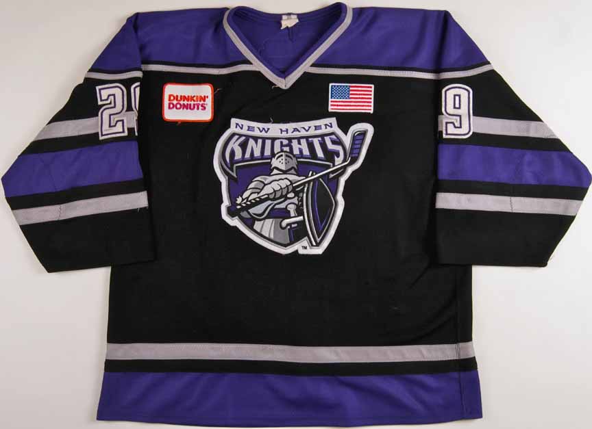
Regal and intimidating
Nothing says intimidating like a black jersey. Spoiler alert there’s more to come. The Knights had a cool logo, but the question was could the colors of purple and gray be incorporated effectively. The answer is yes. These uniforms are beautiful and have the perfect amount of purple with gray accents that really make the jersey stick out. The black makes this jersey both intimidating and sophisticated. Add a great logo with a bold Knight clutching his stick and shield for battle, and you have a great combination. This is one jersey where everything comes together beautifully.
7) New Haven NightHawks (final years)

Patriotism and classic logo come together
Look at these beauties. No this isn’t a team USA jersey, it’s the final New Haven Night Hawks jerseys. The classic Night Hawk logo with clean lines and just the right amount of red and white really make this sweater pop. Hey patriotism and the Night Hawks sounds like a match made in heaven. Hey maybe team USA should borrow these. While these jerseys do inspire the american spirit of a classic New England, they still can’t beat the original…..
6) New Haven Night Hawks Originals

Welcome to the jungle
The pinnacle of New Haven hockey. Nothing says Night Hawks like black and grey. There was a reason the Coliseum was known as the jungle at this time. It was because of the rowdy fans and the home team sporting these bad boys. The Grey outlines really make the black Night Hawk pop on this sweater. Add in the sophistication of the original LA Kings jersey and you have a winner. Ask hockey fans in New Haven and this is without a doubt the most iconic sweater in the city’s history.
5) Yale Bulldogs

Talk about winning in style
When you win a national championship, you want to look good doing it. Sometimes less is more when you look at the Bulldogs sweaters. The double stripe piping on the socks, pants, elbows, and waist is a classic look that you see many teams trying to imitate now, I’m talking to you UCONN. The whiles and Navy with the Yale script on the front with the numbers with the simple “Y” on the shoulders shows that even though these jerseys may be simple, there is a certain element of pureness that you don’t see in hockey anymore. Yale, please never ever change your uniforms! They are already perfect don’t screw these up like many other schools who try to update their “looks”.
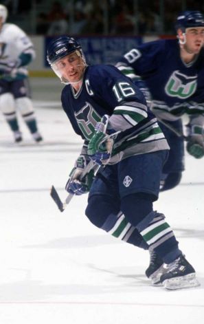
4) Connecticut Whale

Classic history with a twist of modern flare
Too bad these won’t be seen anymore. The former AHL team in Hartford, The Connecticut Whale had jerseys that meshed hockey history with modern design. For the purists you had the old Hartford Whalers colors with the Whale main sake. However, the jerseys add a modern “ocean” fringe along the bottom of the jersey with an updated logo that is both fun and different. Especially with the green jerseys, you could have mistaken this group as the original Whalers.
3) Quinnipiac Bobcats

Quinnipiac hockey makes a statement on the ice with some of the best jerseys in college hockey
For the Quinnipiac Bobcats, while they may be the new kids on the block, no other team has three amazing jerseys in their set. While the white, blue, and the new yellow jerseys are all awesome, I gotta go with these ones. When you watch Quinnipiac in their Yellow jerseys, they defiantly catch your eyes. Yellow is a hard color to pull off, but this shade along with the blue piping makes for an eye-catching and great looking sweater. Not only is the color great, but the Quinnipiac Bobcat logo with the “Quinnipiac” script and swiping Bobcat is a sick logo. If you look closely the head and arm of the bobcat create a Q, talk about a slick design. The running bobcats on the shoulders are just a bonus. The Quinnipiac program is just beginning its bright future and have an awesome pair of jerseys to help with the recruiting.
2 Bridgeport Sound Tigers Original

Why did they get rid of these???
Now these are sick. Black jersey, a fierce blue, and yellow highlights to make the whole thing pop. Throw in an aggressive blue tiger logo and you have the best minor league jersey in state history. Unfortunately for the Sound Tigers, like most other minor league teams, their jerseys are exactly the same as their pro counterparts. While the new jerseys aren’t that bad, the original was bold and gave the Sound Tigers their own unique identity. I don’t know about you, but I wish they would bring these back out of retirement.
1) The Hartford Whalers

Forget great Connecticut jersey, these are one of the greatest all time NHL jerseys
Can the Whalers come back just to get these jerseys back?
Was there any doubt? Forget Connecticut hockey, these are some of the greatest jerseys in NHL history. Let’s see the navy and white jerseys with the silver, green and white piping created a sophisticated look that popped and was easy on the eyes. Could anybody else combine Navy, silver, and green, in such a way. The colors balance each other out and there isn’t an overuse of one color. Oh there’s also one of the greatest logos in sports history. The Whale tail in Navy, the W in Green, and in the negative space between the two the silver forming the letter “H” for Hartford. I wish we could just have an NHL team back for the simple reason that the NHL needs classic jerseys like these again. And people wonder why Whalers jerseys are still so popular after the team left in 1997. Go Whalers! Do you guys agree? Any that I missed? Follow and comment to tell me about what you think.

While I will agree with the worst, and some of the top 10, you have two glaring errors: you use the term “original” for both the Nighthawks and LA Kings when referencing the Black, Silver and White sweater of the Hawks. Those were not their original. The Kings originally used purple and gold. The Hawks original uniforms were gold and blue, as they were affiliated with St. Louis. They then became the Rangers, then the Kings affiliate. I’d also like to point out that while are well in good, I’d have to say the brief, but no less handsome black New Haven Senators sweaters are far better then some on your list. I own a Beast Home sweater, so I will agree with you there. I think that you should have at least given honorable mention to the Whalers Greens, since no one has used those until the late Danbury Whalers.
I have a nighthawks jersey number 30 I can’t remember who’s it was can you tell me