Is their hope for the NHL in Hartford on the horizon? One of the biggest obstacles preventing a team playing in Connecticut’s capital is the lack of a state of the art arena, however that soon may no longer be a problem.

Formerly the Hartford Civic Center, the XL Center is now one of the oldest active arenas in the United States
The Hartford Courant has reported that Oak Street Real Estate Capital, a Chicago firm, will submit a proposal to purchase and renovate the city’s arena later this month. The XL Center, formerly the Hartford Civic Center, is one of the oldest facilities in the country and needs a major overhaul. Currently, the arena hosts concerts is home to UConn Basketball, UConn Ice Hockey, and the AHL’s Hartford WolfPack.
The offer to the city of Hartford did outline the plan to renovate the building and planned to put in over $250 Million with the intention of making it a state of the art facility. The state has proposed two options in recent years, one of which was a $250 Million dollar proposal to bring the current property up to a state of the art facility through renovation.The other, and more expensive option, was to completely tear down the existing structure and build a new arena which would have cost $500 Million.

Artist rendering of what the $250 Million renovation could look like
The outline of the deal would be $50 Million upfront from the group to the state, but the state would pay 7.5% of the renovation costs and would be subject to annual increases of two percent. This would mean at the minimum the state would invest roughly $19 Million for the reconstruction. Just to tear down the existing structure would cost $40 Million
The following is a statement from the Oak Street Group on their interest in acquiring the XL Center.
“Our interest in the XL Center stems from our larger goal of revitalizing the Hartford area. We believe that the transformation of the aging arena into a state-of-the art sports and entertainment venue can be the focal point of the city’s redevelopment and spur economic growth.”
Included in this statement, Oak Street it is ready to close on the acquisition of the building in the coming month and would send its proposal to the state for the upcoming request for proposals.

Could an upgraded arena bring back the NHL? Seattle gives Hartford a glimmer of hope.
If the XL Center is upgraded to a state of the art facility it could put the city of Hartford in the discussion for a potential NHL team. The good news for hockey fans in Hartford is there are two encouraging trends in the National Hockey League that could eventually help the city land a franchise.
The first is the league’s expansion plan. The league is already looking to add a 32nd franchise in Seattle and after a successful ticket drive, Seattle is inching closer to professional hockey. After the success of hockey in Las Vegas due to a new expansion draft that has given the Golden Knights the quality talent to earn a sweep in the first round the NHL playoffs. With the new expansion plan working it is possible that Hartford could land an expansion franchise rather than relocating an existing team.

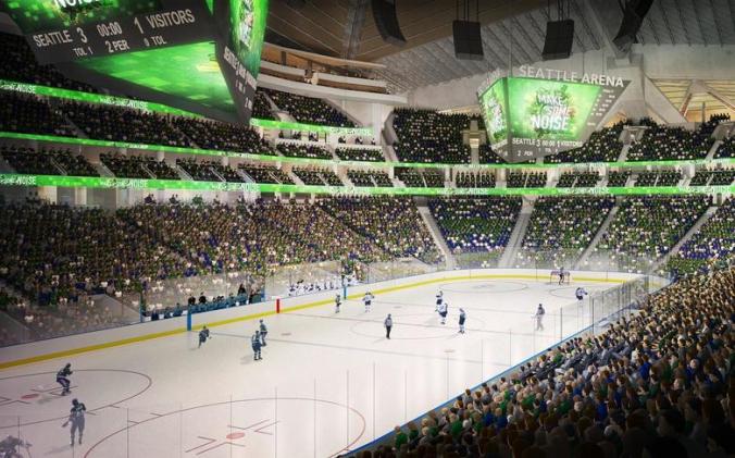
Renderings of Key Arena in Seattle after it is upgraded into a state of the art facility to hold an NHL franchise
The second factor is that Seattle is setting a new arena precedent for attracting an NHL franchise. It was believed that the only way to attract an NHL franchise with a brand new arena. However, if Seattle is awarded an official franchise, it proves that a city can update a pre-existing arena to a modern standard rather than building a new arena. In Seattle, the plan is to extensively remodel Key Arena into a state of the art facility. If the NHL does put a team in Seattle for the 2020 season, it shows that they are willing to put a team in a state of the art facility even if it is not a brand new facility.
Subscribe and follow for the latest updates on this story.
 Before they were the Ducks of Anaheim, a little company called Disney owned an NHL team known as the Mighty Ducks. While the team has desperately tried to change their image from the “Mighty” days, the problem is they never found a better logo then their previous incarnation. The webbed duck foot is a decent shoulder logo, but not a stand alone on the chest. The team has really hit it off with their current third uniform which brings back the double hockey stick duck goalie mask logo with a great color combination. The orange, gold, and black could make for three great uniforms, but one thing they should all have in common is the old Mighty Ducks logo with the new color pallet. The logo is too good to waste, and is the team’s best option unless they can come up with a better design.
 The Penguins don’t have a logo problem, it’s a color problem. Their alternate jerseys are beautiful and should become the full-time uniform combo for a few reasons. One, it’s more vibrant and eye catching. Two, it pays tribute to the great Penguins’ teams of the early 90’s. Third, and most importantly it ties time with the rest of the city’s black and yellow color pallet. There’s nothing wrong with their current gold, it just doesn’t match the Steelers and Pirates. It’s time for all the Pittsburgh teams to be on the same page.
 The Hurricanes have always had a very generic look with a less then inspiring logo. I’m sorry but if your logo reminds people of swirling toilet water, you have room for improvement. The team should completely change their image and go with the alternate uniform logo and design. The design is different then other teams, but most importantly the alternate logo is a vast improvement. The hurricane storm flag whipping in the wind on a hockey stick is a perfect logo for the team’s namesake, while the background triangle representing the state’s research triangle, is a subtle touch that pays homage to their Carolinas.
 The Coyotes have always had an image problem, especially over the past few seasons. Since the team changed their brand, there has been a lot of confusion with uniforms featuring red, tan, and black with a generic looking howling coyote logo. This season the team brought back their 90’s throwbacks, which is a look they should go back to. The red, green, tan, and purple color pallet gave them a definitive look that none in the league could match, and the original coyote logo not only payed tribute to the native american tribes in the state, but was truly one of the most unique logos in NHL history. It’s time for the Coyotes to turn back the clock.
 The Avalanche hit a home run with their new third uniform logo and design. The simpler design, and look perfectly sums up the team namesake and the city of Denver. While their current “A” logo is good, the main concern with the Avalanche brand is the uniforms. The current home and away set have so much going one with all the piping, design, colors, and odd number fonts. The current alternates a crisp, simple, and feature a great new logo. This is a look that the team should consider making a full-time change.


