The NHL is known for some of the best logos in professional sports. The Original Six of the Maple Leafs, Blackhawks, Rangers, Bruins, Canadiens, and Red Wings have classic logos that have withstood the test of time. There are of course many other teams in the league and while some of them have great logos, some well are almost as bad as an NHL lockout. It takes a lot to make a great logo and sometimes teams try to hard to have a unique look. Other times teams have great logos but for whatever reason feel they need to “modernize” the teams image. A team’s logo is it’s identity and sometimes when these changes are made to beloved logos the fans will make their disapproval well-known. Here are the worst logos in NHL history
1) New York Islanders: the Gorton’s Fisherman

Apparently the Gorton’s fisherman plays hockey now
You know it’s a disaster when your new logo only last one season. In 1995 the Islanders changed from their iconic colors and logo to feature ocean blue and orange colors with the new fisherman logo. Ok I dare someone to tell me they like this logo. The fans were of course furious when the iconic long island and stick logo was replaced by this disaster. It also doesn’t help when every other team begins chanting “we want fish sticks” when they play your team. Seriously Islanders, did you get a secret sponsorship with Gortons just so they could put their fisherman in your logo? The Islanders quickly realized their blunder and when they were able to removed this logo from the jersey, but it took them years to go back to their iconic jerseys which they won their Stanley Cups in. This is one logo that I know Islanders’ fans never want to see again!
2 Dallas Stars: The artist apparently failed anatomy

Bull + Stars = What is that?
This logo was one of the most controversial in NHL history. It’s supposed to be the constellation of Taurus which is confusing and doesn’t make sense. However, this logo is infamous for being called the “Stars uterus logo”. Obviously this was a P.R. nightmare and the jerseys only lasted two seasons. While the Stars went out on a limb with this logo it still makes you wonder what the heck were they going for? Green bulls, red comets, stars all over the place it doesn’t make sense! Can’t you do a Northstars logo instead? Also maybe hire a logo designer who understands what anatomy looks like to you don’t offend people! While the stars have reverted back to their old logo, this terrible idea will defiantly haunt them for some time.
3 Boston Bruins: The Bruin
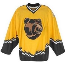
Why the an original six team would use a different logo I will never know
For the late 90s and early 2000s the Bruins called this eyesore their third jersey. Hmm the Bruins spoked wheel or classic walking Bruin logo, two of the best logos in NHL history were overlooked for this??? For future reference to any team out there, if your mascot is a fierce animal for the love of god don’t make it look like something a five-year old would want to hug. When I hear little kids say that bear is cute it just makes me wonder how the Bruins must have felt wearing this on the ice against other teams. OOOOOOHHHH the big bad taxi cabs with the giant beanie baby head jersey are going to get us!! If you’re an original six team you already have great logos. Don’t try to reinvent the wheel, pun intended, just use what works!!
4) Pittsburgh Penguins: the triangle bird

Another attempt to modernize a classic logo
Ok I’m no bird expert but I don’t think penguins look like triangles. I’m just glad Sid the Kid didn’t have to wear this pathetic logo. Another case of let’s take another iconic logo, the skating penguin, and make it sleeker. This logo likes like it should be used for a shipping company not an NHL franchise. It’s too simple and when you replace an iconic logo you better up the ante. Fortunately the Penguins realized their mistake and have gone back to the skating penguin logo that we all know and love. I’m still trying to figure this one out.
5 ) Nashville Predators: trying again and again

Another failed attempt by the Predators to have a good logo
One of the problems of being an expansion team is that you have create a new logo. The Predators have done this again… and again…. and again. Now they have a sleeker yellow and blue predator which while not the best logo s far better than it’s predecessors. For a franchise that at one point actually used a skull as a logo picking the worst logo of the bunch was like trying to pick the king of the stupids. But this one takes the case. It’s not menacing, has way too many colors, and is trying to do to many things at once. I understand that it’s not easy to make new logos but I mean come on this looks like it should be on the Flintstone’s cartoon not an NHL sweater. At least Nashville has learned from this disaster
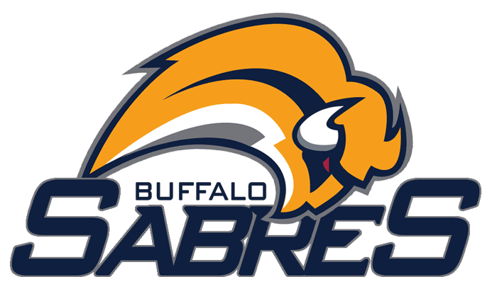
6) Buffalo Sabres : Buffaslug

Let’s play guess what this logo looks like
Look on the ice it’s a slug, no it’s a Pikachu, no it’s Donald Trump’s hairpiece! Nope this is the famous buff-slug logo the Sabres wore from 2006-2010. After years of an updates Sabres logo and team colors of red, black, and grey. The club decided to go back to its original color scheme. Good idea! Bad idea instead of using the classic logo the fans love let’s use a modern version! Ok what buffalo has no legs? Seriously Buffalo another great logo passed over for this. No wonder fans were pissed. When you can’t even tell what your mascot is you know you have a serious logo problem.
7) LA Kings: Would you like fries with that?

The Great One wore this? I didn’t know he worked part-time at B.K.?
Wow Burger King got a new mascot? Nope, believe it or not Wayne Gretzky and the Kings wore this logo for hockey. If they played the Islanders we could have a full meal! Seriously you guys there were no food sponsorships under the table? Is Ronald McDonald next in on the action? This logo looks like they tried to make a barbarian looking king look intimidating. Ok if you’re not the Lakers or LSU don’t try using purple and gold. they know how to use it, you don’t. When your logo gets confused for a fast food mascot you know you messed up. Could be worse, the mascot could have looked like the chick for Wendys.
8) Columbus Blue Jackets: Weird Jacket

Beware of the killer bee?
The Blue Jackets are supposed to be about the Blue Jackets of Columbus that fought in the Civil War. Now A Blue Jacket isn’t exactly an easy mascot to create, but come on a bee with red eyes in a Civil War outfit? Seriously? Nothing says we’re a great hockey team like having an angry-looking wasp as a logo. Not to point out the obvious but how is a bee supposed to wear clothing? More importantly if they are the blue jackets why is the bee a yellow jacket? Thank god Columbus got rid of this train wreck. While their new logo isn’t exactly great either, it sure beats the angry bees. Jeez I can just hear Nicholas Cage “not the bees!!!! AAAAHHHHH”!
9) Mighty Ducks of Anaheim: Wild Wing to the rescue?

Thank you Anaheim, this ruins one of my favorite kids shows
Oh boy. This one hurts me. I loved the animated Mighty Ducks TV show as a kid. I loved Wild Wing as the leader of the Ducks. Crazy TV show, yes but it did get me into hockey at a young age. So in a brilliant move by the Mighty Ducks let’s throw Disney, the tv show, the pro team, mascot, and jersey into a blender mix it up and get this. I know it’s a eehh logo but the worst part of it was that this was the chest logo for the alternate jersey for a period of time. I could see it now asking NHL players with no teeth “excuse me, would you mind wearing this Disney jersey, the kids will love it”! For all those Mighty Ducks players that has to wear this, on behalf of all NHL fans sorry about that.
10) California Seals: Kindergarten project

Seriously? This was the best you could come up with?
As if it wash;t bad enough that a team had to be called “The Seals”. How can we possibly make it worst? Give them a logo that looks like it was created in a kindergarten art class! Look at this. The colors are awful, the logo looks like a native american craving, and how does that look like a seal? This should be on some grandmothers refrigerator not on an NHL sweater! Seriously we couldn’t put an actually seal in the logo? That looks like a fishing lure not a seal! I guess the only good news is that this logo isn’t around anymore. Sorry Californians, like your former governor something’s are better off being terminated after a while. Do you agree of disagree? What do you think is the worst NHL logo? Comment below!