- Anaheim Ducks:
 Before they were the Ducks of Anaheim, a little company called Disney owned an NHL team known as the Mighty Ducks. While the team has desperately tried to change their image from the “Mighty” days, the problem is they never found a better logo then their previous incarnation. The webbed duck foot is a decent shoulder logo, but not a stand alone on the chest. The team has really hit it off with their current third uniform which brings back the double hockey stick duck goalie mask logo with a great color combination. The orange, gold, and black could make for three great uniforms, but one thing they should all have in common is the old Mighty Ducks logo with the new color pallet. The logo is too good to waste, and is the team’s best option unless they can come up with a better design.
 - Pittsburgh Penguins:
 The Penguins don’t have a logo problem, it’s a color problem. Their alternate jerseys are beautiful and should become the full-time uniform combo for a few reasons. One, it’s more vibrant and eye catching. Two, it pays tribute to the great Penguins’ teams of the early 90’s. Third, and most importantly it ties time with the rest of the city’s black and yellow color pallet. There’s nothing wrong with their current gold, it just doesn’t match the Steelers and Pirates. It’s time for all the Pittsburgh teams to be on the same page.
 - Carolina Hurricanes:
 The Hurricanes have always had a very generic look with a less then inspiring logo. I’m sorry but if your logo reminds people of swirling toilet water, you have room for improvement. The team should completely change their image and go with the alternate uniform logo and design. The design is different then other teams, but most importantly the alternate logo is a vast improvement. The hurricane storm flag whipping in the wind on a hockey stick is a perfect logo for the team’s namesake, while the background triangle representing the state’s research triangle, is a subtle touch that pays homage to their Carolinas.
 - Phoenix Coyotes:
 The Coyotes have always had an image problem, especially over the past few seasons. Since the team changed their brand, there has been a lot of confusion with uniforms featuring red, tan, and black with a generic looking howling coyote logo. This season the team brought back their 90’s throwbacks, which is a look they should go back to. The red, green, tan, and purple color pallet gave them a definitive look that none in the league could match, and the original coyote logo not only payed tribute to the native american tribes in the state, but was truly one of the most unique logos in NHL history. It’s time for the Coyotes to turn back the clock.
 - Colorado Avalanche:
 The Avalanche hit a home run with their new third uniform logo and design. The simpler design, and look perfectly sums up the team namesake and the city of Denver. While their current “A” logo is good, the main concern with the Avalanche brand is the uniforms. The current home and away set have so much going one with all the piping, design, colors, and odd number fonts. The current alternates a crisp, simple, and feature a great new logo. This is a look that the team should consider making a full-time change.
pittsburgh penguins
Ranking the NHL’s Stadium Series Jerseys
7: Pittsburgh Penguins

Why not bring back the powder blues?
For the Winter Classic the Penguins have been known to wear their old school powder blue uniforms or some combination of the powder blues. It was a surprise when they released a jersey with none of these elements for the Stadium Series game. True it may not be as important as the Winter Classic, but it would have been nice to see the Penguins in their old school blue jerseys. What makes it worse is that they just basically rolled out a watered down version of their current jerseys. The only change is the striping on the jerseys which is boring. If anything, they could have gone with the old black and yellow color palette instead of basically the same exact jersey colors they use all the time. With so many options for the Penguins, it was disappointing that this was the best they could come up with.
6: LA Kings

Grey and boring
Even though black and grey is a great color scheme, the Kings somehow screwed this up. Instead of doing a solid black jersey or bringing back the old Kings logo during the Gretzky era, the Kings just put out a grey jersey that looks like it should be a practice jersey. With weird LA should logos, the old crown logo, there just isn’t much to say about these uniforms. They’d have been better off with more black or going back to the old school purple and gold. The would have been awesome to see the purple and gold on the ice again.
5: New York Rangers

Really? Let’s just rip off the Hartford Wolf Pack
The Rangers Winter Classic is one of my favorite jerseys of all time. I had high hopes for the Stadium Series hoping they would bring back a cream colored jersey or another old school look. Instead, the Rangers created a new look that looks like a combination between their old 90s alternates and the Hartford Wolf Pack. Silver? Really? The silver makes no sense, I’d rather see cream than silver. If they were going in this direction, they should have brought back the old statue of liberty logo instead of the New York script across the chest. With better logos and colors, the Rangers struck out when it came to Stadium Series jerseys.
4 Chicago Blackhawks
Back in Black
The Blackhawks had the best Winter Classic jerseys with their classic logo and design. This year, the jerseys are good, but nothing special. It just feels like a lazy attempt. Just a basic black jersey with the current logo. Sure the black looks great with the red and black, but it would have been nice for the Blackhawks to bring back their old logo or jerseys. While it’s not the worst jersey, it’s by no stretch the best.
3: Anaheim Ducks
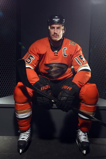
Orange is tough to pull off, but the Ducks do it well
These jerseys by the Anaheim Ducks are very good. I love the orange color which both pops, but at the same time isn’t obnoxious like some orange jerseys can be. The burnt orange color is something different that you never see in a uniform and looks great with the black, gold, and white trim. The reason this jersey isn’t higher is the logo. While the Giant webbed D is good, we’ve seen it before. True it’s better than the “Ducks” script jersey, but I would have like to see them use the old Mighty Ducks logo with the mask and interlocking sticks. I have always been begging the Ducks to bring back that logo and think that would have been a great time to bring it back. Had they used that logo, they could have been on the top of the list, but without it they stay at number three.
2: New York Islanders
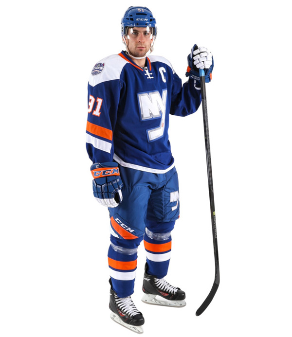
Old school and new school meet for a great combination
Given the Islanders’ illustrious uniform history which includes some of the worst jersey disasters in hockey history, I was skeptical when it came to their Stadium Series jerseys. However, the Islanders jerseys are incredible and the one jersey in the Stadium Series that should become the team’s third uniform. This would be so much better than those stupid black jerseys the Islanders have. With the classic blue, orange, and white colors, this jerseys looks beautiful. Add in the horizontal stripes on the arms and pants, clean white shoulder stripes and this is an aesthitically pleasing jersey. Then the logo, finally a team that tried something new. I love how the Islanders incorporated the NY part of their logo with a modern twist on the chest. Overall this is a great jersey, and I hope the Islanders keep using these after the Stadium Series.
1: New Jersey Devils
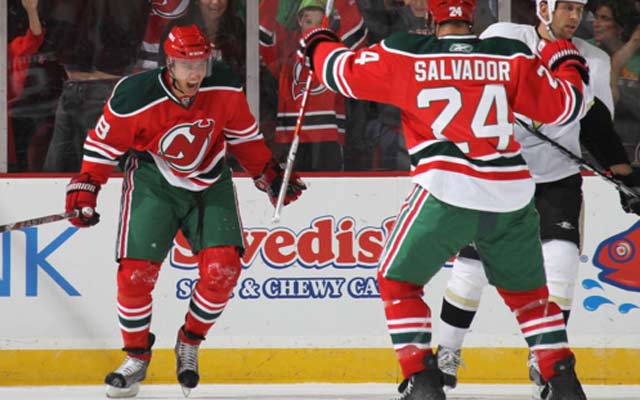
A Classic
The Devils jersey may not be new or innovative, but it’s nice to see at least one team honor their heritage. Sure Christmas colors may not sound like a winning combination on a hockey sweater, but the Devils make it work. The red, white, and green is simple and beautiful. These jerseys pop with their red color scheme and the green and white highlights are crisp and mesh well together. Sure it may look like Christmas on ice, but who doesn’t love Christmas? Finally the Devils have one of the best logos in hockey, so why mess with perfection? Great logo, great jersey, clearly the winner. Do you agree or disagree? Which was the best Stadium Series jersey and which was the worst? Comment and like below!
The 5 best uniforms from the NHL’s Winter Classic
The NHL Winter Classic has become one of, if not the most entertaining part of the NHL season. It may be only one game, but seeing the pros in an outdoor game the is reminiscent of the days when kids would play pond hockey is something special. Being outside in the winter elements was is hockey hockey was meant to be played, and watching your favorite players battle it out in the snow on an outdoor rink is highly entertaining. Apart from playing in the elements and visiting some of the most unique outdoor venues in sports, one of the best things about the Winter Classic is the uniforms. Some of the best hockey jerseys come from the Winter Classic as team’s bring back classic uniforms or combine aspects of older teams to create unique and gorgeous looks. Winter Classic jerseys are some of the league’s best-selling uniforms and have even become some team’s alternate jerseys. While I want to see some of these jerseys be used full-time, the fact that they are one and done for the most part makes them even more special. Here is my list for the best jerseys the Winter Classic have provided.
Honorable mention: Philadelphia Flyers

These are great uniforms, but didn’t break the mold like others did
For the 2012 Winter Classic the Philadelphia Flyers wore these great uniforms against the Rangers. While there 2010 jerseys would eventually become their regular jerseys, the 2012 jerseys bright orange and black jerseys were eye-popping. Why did I officially leave them off the list even though they were great? Most winter classics really mixed it up compared to a team’s normal set. While different the Flyers jersey didn’t stray too far from the normal home jerseys the flyers wear. True the black and off were different and while they looked terrific these sweaters just didn’t break any new ground. Sorry Flyers fans, these are great but I fell the Flyers could have done better in terms of a Winter Classic Jersey.
5) Boston Bruins:
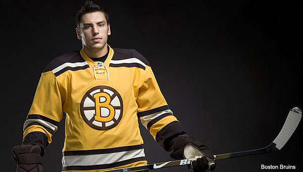
Reinvent the spoke wheel? I think that’s a yes
Yellow and Brown. Sounds like a horrible combination. These colors make you think of a rotten banana, but somehow the Boston Bruins were not only able to pull it off, but look good in the process. Bringing back the original colors of the franchise in this clean and sharp look was a major win when the Bruins took the ice at Fenway Park. When the Bruins said they would be updating the spoked wheel logo many fans would have said this was sac-religious. However, the spoked wheel featuring a curvier B looked create and proved that you can tweak an original six logo and still make it look good.
4) Pittsburgh Penguins:

How would’ve thought baby blue could work as an NHL jersey?
When you mention the color of baby blue you think of little boys in footsie pajamas, not men with their front teeth knocked out. In the first Winter Classic the Pittsburgh Penguins went deep into their uniform archives to bring back the original logo and color for the team. Most Penguins fans never even knew the team had blue colors in their history. These jerseys were simple, clean, and well-balanced between the three colors. With the snow falling throughout the game, it just made the jerseys even more appropriate because the white snow with the cool blue Penguins jersey just made you think of winter. While this is a difficult color to pull off, the Penguins did it in fine fashion. It also helps that when people think back to the inaugural classic they remember Sidney Crosby scoring the game winning goal in this beautiful sweater.
3) Detroit Red Wings

Another original six team that has combined great colors with a classic logo
Ok, I know these haven’t technically been used yet but I love them already. The Red Wings will wear these classic uniforms for the 2014 Winter Classic in the Big House. I love the use of the original Red Wings winged wheel logo. The red and tan color pattern both pops and adds a great intimidation factor. Other things I love about this sweater is the double stripe pattern with one thick and one skinny stripe on the shoulders, arms, and bottom of the jersey. Another first is that these jerseys will have the captain and assistant captain’s letters on the right sleeve stripe just like they used to do in the early days. Add in the awesome “Detroit”script and these jerseys are a winner.
2) New York Rangers

A throwback that I wish the Rangers would make a permanent alternate
Man I love these jerseys. Can the use these to replace the current alternates. The Rangers Winter Classic jerseys are great. The off white color with the red and blue stripes looks both vintage and patriotic. Then you add in the original Ranger shield logo and you have a perfect jersey. I personally prefer the curvier shelf the Rangers used in these jerseys because it actually looks like an actually shield unlike the current logo. With the Rangers terrible current third jerseys I propose that the Rangers bring these uniforms back full-time as the alternate jersey. Without question these are my favorite sweaters the Rangers have ever worn.
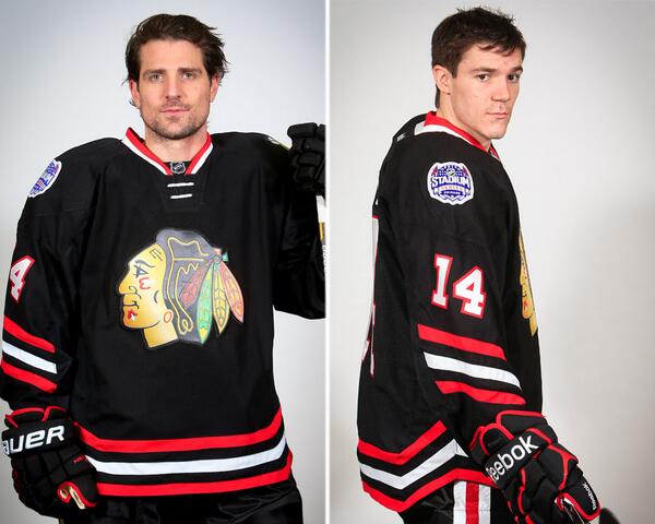
1) Chicago Blackhawks

The best of the Blackhawks jerseys. Bring them back full-time
This is one of, if not my favorite hockey jersey ever. Look at these beauties don’t they just scream hockey. Not says intimidating like a black and red jersey. These black jerseys have a great combination of colors from the red, tan, and black color palette. The hockey pants with the red and tan outlines and the red triangles add details make these the pants my favorite hockey pants on a uniform. Colors only do so much for this jersey. I love the old school design of the horizontal stripes in the jersey which is both different and breaks up the jersey nicely. It also draws your eyes into the logo which is the best Blackhawks logo in their history. The crest with the Chicago Blackhawks script surrounding the original Blackhawks logo is one of the best logos not being used in the NHL right now. I love these jerseys so much I think that Blackhawks should bring these backs as their third jersey if not their regular jersey. While the later is less likely to happen I’m begging that the Blackhawks bring back not only the best Winter Classic jersey but one of the best jerseys in NHL history. What was your favorite Winter Classic classic jersey? Do you agree of disagree? Comment below and take the poll to vote for your favorite.
