7: Syracuse
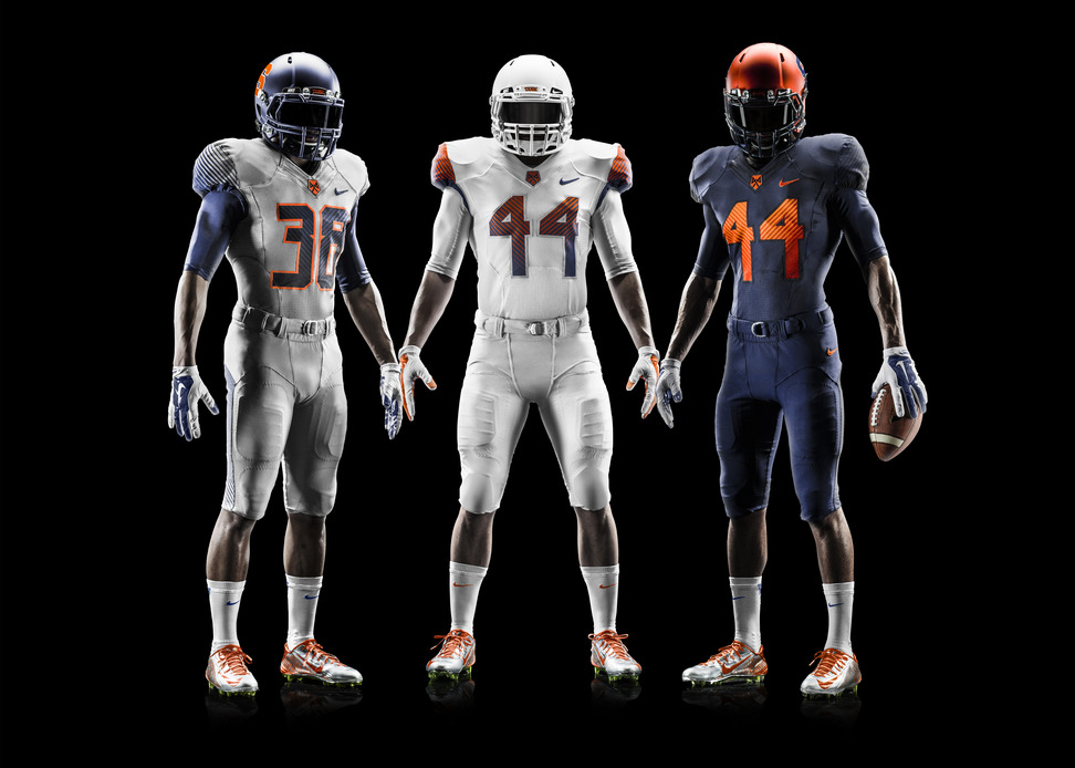
A sorry excuse for a uniform
Wow just wow. When you’re the Orange why do you have a gray jersey instead of an orange one. While the all white look is ok, the Orange helmet along with the blue and grey uniforms are an atrocity. With such a classic logo and uniform why is Syracuse trying to hard to change it? The final straw is the numbers. Oversized, too blocker, and with different color stripes in the number? Syracuse, you’re no longer in the Big East, people will actually see you looking terrible on National TV. Can you change these immediately?
6: Illinois

Illino
These are just ok. There’s nothing new or exciting about these uniforms. The colors are solid and the uniforms don’t have any weird design choices that make them an eyesore. If this was a report card these uniforms would be a C -. Would have been nice to see more, but could always have been much worse.
5: Florida State

OOOOHHHH OOOOHHHH NNNNOOOO NNNNOOOO
Now I am going to take some heat for this one. While the Seminoles have tried to just modify and streamline their uniforms the result has not been good. The designs are unique but very distracting. The new black uniform is awesome, but the two-tone helmet is just awful. Florida State, just look at Jacksonville how’s that two-tone helmet idea working out for them? The main problem with these uniforms? Florida State had some of the best and most traditional uniforms in College Football. Why replace a classic?
4: Miami Hurricanes

Are U kidding me?
Oh Florida what’s happening? Is it something in the water causing another team to change a classic look? The uniforms are awesome. Well, the orange, green, and white all look streamlined and great. Also, the gloves are probably the best in college football. But, here is what kills these awesome jerseys. First, the helmet drops the orange and green stripe in the middle. While not terrible, the idea to put the Ibis on the shoulders and as a grey backdrop to the helmet was a terrible idea. The once iconic helmet has been replaced by this? Finally an all organ helmet and grey uniform? If anything Miami go with a black jersey and helmet instead of this fourth jersey disaster.
3: Washington

These Huskies have some bite
While the purple jersey isn’t a winner, the white and black are great. The helmets look good and the balance of purple and gold is well done. Also, a nice touch with the gold and purple numbers. Usually putting two colors in the number looks ridiculous but Washington pulls it off. The all white and all black uniforms are menacing and are some of the new better designs in college football.
2: Arkansas
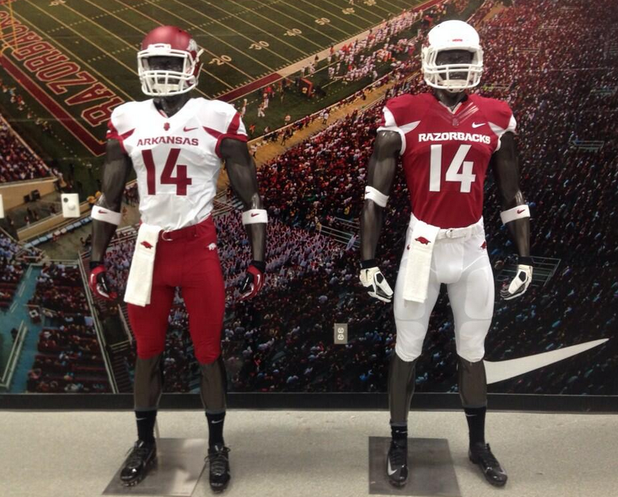
New Razorbacks, same great Arkansas program
See guys. Sometimes less is more. While the Razorbacks have upgraded their logo this year, their uniforms also got a much need upgrade. Gone are the weird checker patterns on the uniforms which are replaced by subtle but fierce striping. The faded red helmet, and all white helmet both look great and it’s nice to see a team with just two uniforms. Arkansas proves that teams don’t need to reinvent the wheel or come up with an off the wall design to have great looking uniforms.
1: Oregon

Still the best in the business
Was there ever any doubt? When it comes to college football uniforms Oregon sets the standard year after year. The all white and green uniform is sleek. With the wing design on the shoulders and green helmet this uniform would have been the best except for its counter part. The new black uniform is incredible. The yellow and white wings on the shoulder are absolutely jaw dropping. With the faded silver helmet and the silver, white, and black numbers with the yellow trim are truly incredible. Once again, Oregon may not have the best team in college football, but they will have the best looking team in all of college football.
