- Anaheim Ducks:
 Before they were the Ducks of Anaheim, a little company called Disney owned an NHL team known as the Mighty Ducks. While the team has desperately tried to change their image from the “Mighty” days, the problem is they never found a better logo then their previous incarnation. The webbed duck foot is a decent shoulder logo, but not a stand alone on the chest. The team has really hit it off with their current third uniform which brings back the double hockey stick duck goalie mask logo with a great color combination. The orange, gold, and black could make for three great uniforms, but one thing they should all have in common is the old Mighty Ducks logo with the new color pallet. The logo is too good to waste, and is the team’s best option unless they can come up with a better design.
 - Pittsburgh Penguins:
 The Penguins don’t have a logo problem, it’s a color problem. Their alternate jerseys are beautiful and should become the full-time uniform combo for a few reasons. One, it’s more vibrant and eye catching. Two, it pays tribute to the great Penguins’ teams of the early 90’s. Third, and most importantly it ties time with the rest of the city’s black and yellow color pallet. There’s nothing wrong with their current gold, it just doesn’t match the Steelers and Pirates. It’s time for all the Pittsburgh teams to be on the same page.
 - Carolina Hurricanes:
 The Hurricanes have always had a very generic look with a less then inspiring logo. I’m sorry but if your logo reminds people of swirling toilet water, you have room for improvement. The team should completely change their image and go with the alternate uniform logo and design. The design is different then other teams, but most importantly the alternate logo is a vast improvement. The hurricane storm flag whipping in the wind on a hockey stick is a perfect logo for the team’s namesake, while the background triangle representing the state’s research triangle, is a subtle touch that pays homage to their Carolinas.
 - Phoenix Coyotes:
 The Coyotes have always had an image problem, especially over the past few seasons. Since the team changed their brand, there has been a lot of confusion with uniforms featuring red, tan, and black with a generic looking howling coyote logo. This season the team brought back their 90’s throwbacks, which is a look they should go back to. The red, green, tan, and purple color pallet gave them a definitive look that none in the league could match, and the original coyote logo not only payed tribute to the native american tribes in the state, but was truly one of the most unique logos in NHL history. It’s time for the Coyotes to turn back the clock.
 - Colorado Avalanche:
 The Avalanche hit a home run with their new third uniform logo and design. The simpler design, and look perfectly sums up the team namesake and the city of Denver. While their current “A” logo is good, the main concern with the Avalanche brand is the uniforms. The current home and away set have so much going one with all the piping, design, colors, and odd number fonts. The current alternates a crisp, simple, and feature a great new logo. This is a look that the team should consider making a full-time change.
uniforms
NFL’s COLOR RUSH Needs to be Stopped!
Stop the madness! Stop the madness please! Two weeks into the NFL’s Color Rush uniform program it is clear that this idea was terrible. No, it’s no just that last week’s designs left millions of color blind fans scratching their heads trying to figure out which team had the ball, or that it looked like Christmas vomited in the Meadowlands.
If that wasn’t enough we get the Titans and Jaguars in the Thursday Night matchup tonight in uniforms that just make fans groan.  Let’s start with the Titans. I understand that they’ve worn
the powder blue color in the past but the monotone light blue look is horribly. That’s the main problem with the color rush uniforms is that it’s basically one solid color. If the pants or even the socks were a different color it would balance out the uniforms much better. Instead the Titans looks like oversized infants in baby blue onesies.
And then there are the Jaguars, or the Gold Rangers from Power Rangers. I really can’t tell the difference. This isn’t even a Notre Dame gold and  looks like the mustard one might find in the back of the cabinet that’s five years past it’s expiration date. What’s even worse? The fact that the Jaguars didn’t go with a all gold helmet but keep their terrible two-tone helmet that’s already a disaster.
Do I give the NFL credit for trying something new? Yes, but this idea just seems like a quick cash grab in order to sell more jerseys. Instead of pushing the envelope with new or innovative designs, the league has just decided to basically keep the same uniform, dose it in one bright color and they’re done. I love the idea of new uniforms and having the Thursday game be the embodies different uniforms but the NFL is missing a golden opportunity.
Instead of Color Rush the NFL should do Throwback Thursday next season. That way fans can see the great looks of the past while fans of those respective teams can buy the throwbacks at the team store. There are so many teams with great throwbacks it’s an opportunity for the NFL to not only make additional revenue off of uniforms, but to honor it’s rich history.

Just look at what could have been this week. The Titans could have worn their Oilers throwbacks. What about the Jaguars? Even though Jacksonville has only been in existence since 1995, they still can use throwback uniforms. My suggestion would be their original 1995 uniforms which utilize their original logo and teal colors.
 There are so many teams with iconic throwbacks and it would be great to see them again. A couple of favorites could be the Elway Broncos, the Eagles kelly greens, and of course the Bucs creamsicles. The hashtag throwback thursday has already become a staple in pop culture, so why can’t the NFL utilize this? There are plenty of great opportunities to honor the past uniforms rather then just running out this monotone disasters that are the Color Rush threads. I understand that Color Rush is here to stay for this season, but can we please let these terrible uniforms go after the season and give the people what they really want? Throwback Thursday Night Football.
Buck Stops Here: Milwaukee Unveils New Logo
The Milwaukee Bucks have a young and talented roster that the franchise is looking to  build around. However, for the 2015-2016 season the Bucks will have a new look with new uniforms and logos. The primary logo features a more aggressive and formidable stag that replaces the softer looking former logo. The new logo also features a subtle M that forms the neck while also having Milwaukee’s first letter having a prominent place in the logo.
The team has also changed the color palette adding cream as the secondary color over the previous red. With the red color gone, the Bucks will now use  white and blue as their accent colors.
Overall the logo and colors feels more rustic which makes sense given Milwaukee’s mascot. The secondary logos are also solid new logs which not only look great, but play more to the state’s 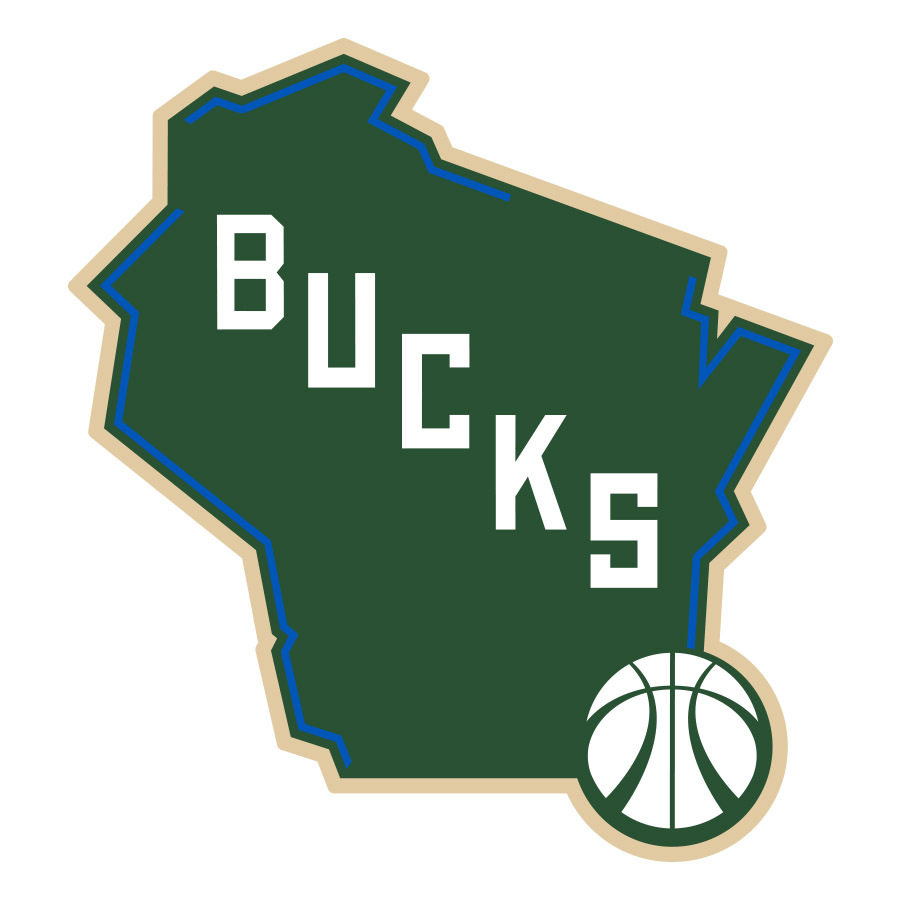 heritage.
Ranking the NHL’s Stadium Series Jerseys
7: Pittsburgh Penguins

Why not bring back the powder blues?
For the Winter Classic the Penguins have been known to wear their old school powder blue uniforms or some combination of the powder blues. It was a surprise when they released a jersey with none of these elements for the Stadium Series game. True it may not be as important as the Winter Classic, but it would have been nice to see the Penguins in their old school blue jerseys. What makes it worse is that they just basically rolled out a watered down version of their current jerseys. The only change is the striping on the jerseys which is boring. If anything, they could have gone with the old black and yellow color palette instead of basically the same exact jersey colors they use all the time. With so many options for the Penguins, it was disappointing that this was the best they could come up with.
6: LA Kings

Grey and boring
Even though black and grey is a great color scheme, the Kings somehow screwed this up. Instead of doing a solid black jersey or bringing back the old Kings logo during the Gretzky era, the Kings just put out a grey jersey that looks like it should be a practice jersey. With weird LA should logos, the old crown logo, there just isn’t much to say about these uniforms. They’d have been better off with more black or going back to the old school purple and gold. The would have been awesome to see the purple and gold on the ice again.
5: New York Rangers

Really? Let’s just rip off the Hartford Wolf Pack
The Rangers Winter Classic is one of my favorite jerseys of all time. I had high hopes for the Stadium Series hoping they would bring back a cream colored jersey or another old school look. Instead, the Rangers created a new look that looks like a combination between their old 90s alternates and the Hartford Wolf Pack. Silver? Really? The silver makes no sense, I’d rather see cream than silver. If they were going in this direction, they should have brought back the old statue of liberty logo instead of the New York script across the chest. With better logos and colors, the Rangers struck out when it came to Stadium Series jerseys.
4 Chicago Blackhawks
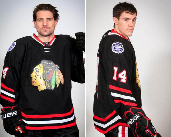
Back in Black
The Blackhawks had the best Winter Classic jerseys with their classic logo and design. This year, the jerseys are good, but nothing special. It just feels like a lazy attempt. Just a basic black jersey with the current logo. Sure the black looks great with the red and black, but it would have been nice for the Blackhawks to bring back their old logo or jerseys. While it’s not the worst jersey, it’s by no stretch the best.
3: Anaheim Ducks
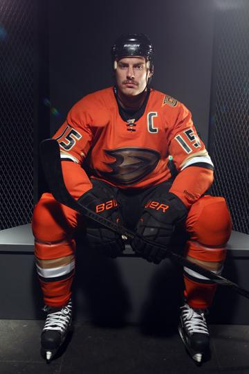
Orange is tough to pull off, but the Ducks do it well
These jerseys by the Anaheim Ducks are very good. I love the orange color which both pops, but at the same time isn’t obnoxious like some orange jerseys can be. The burnt orange color is something different that you never see in a uniform and looks great with the black, gold, and white trim. The reason this jersey isn’t higher is the logo. While the Giant webbed D is good, we’ve seen it before. True it’s better than the “Ducks” script jersey, but I would have like to see them use the old Mighty Ducks logo with the mask and interlocking sticks. I have always been begging the Ducks to bring back that logo and think that would have been a great time to bring it back. Had they used that logo, they could have been on the top of the list, but without it they stay at number three.
2: New York Islanders
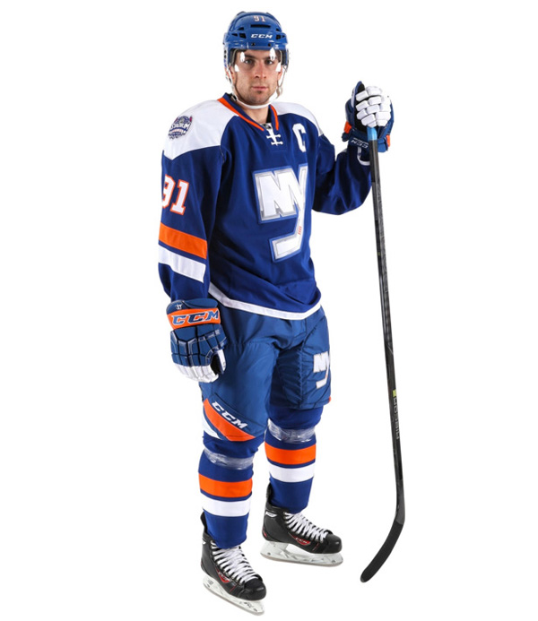
Old school and new school meet for a great combination
Given the Islanders’ illustrious uniform history which includes some of the worst jersey disasters in hockey history, I was skeptical when it came to their Stadium Series jerseys. However, the Islanders jerseys are incredible and the one jersey in the Stadium Series that should become the team’s third uniform. This would be so much better than those stupid black jerseys the Islanders have. With the classic blue, orange, and white colors, this jerseys looks beautiful. Add in the horizontal stripes on the arms and pants, clean white shoulder stripes and this is an aesthitically pleasing jersey. Then the logo, finally a team that tried something new. I love how the Islanders incorporated the NY part of their logo with a modern twist on the chest. Overall this is a great jersey, and I hope the Islanders keep using these after the Stadium Series.
1: New Jersey Devils
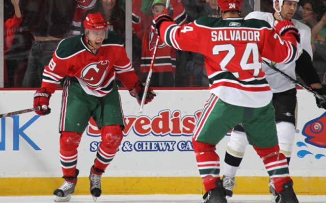
A Classic
The Devils jersey may not be new or innovative, but it’s nice to see at least one team honor their heritage. Sure Christmas colors may not sound like a winning combination on a hockey sweater, but the Devils make it work. The red, white, and green is simple and beautiful. These jerseys pop with their red color scheme and the green and white highlights are crisp and mesh well together. Sure it may look like Christmas on ice, but who doesn’t love Christmas? Finally the Devils have one of the best logos in hockey, so why mess with perfection? Great logo, great jersey, clearly the winner. Do you agree or disagree? Which was the best Stadium Series jersey and which was the worst? Comment and like below!
Jingle Balls: The NBA’s Christmas Jerseys Disaster
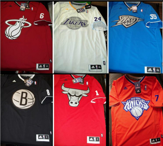
It’s beginning to look a lot like a Christmess
Christmas is here! The trees, decorations, and yuletide spirit are everywhere this time of year. On the 25th of December the NBA will be unwrapping some presents that frankly should have a sticker that reads “Do not open ever”! That’s right, the NBA has established a new merry tradition that is the equivalent to the gifting of a holiday fruitcake. Nobody wants it, but we get it anyways. Talk about a mess. The NBA has tried to establish Christmas day as it’s own holiday. What I mean by this is that football has Thanksgiving, so naturally the NBA wanted it’s own holiday in the spotlight, in this case Christmas. Now the NBA has five games for 2013 and like all great Christmases decided it needed its own traditions. However, whoever came up with this idea should receive a mountain of coal for Christmas.
The NBA has made it a tradition to wear new uniforms on Christmas day. Last year I thought the NBA couldn’t do worse than hideous one color uniforms with just outlines of the team’s name. Well one thing I can say about the NBA is that it never ceases to surprise me. When the new uniforms were revealed I laughed thinking oh they must have gotten the pictures mixed up. Those are ten-dollar t-shirts from the gift shop. Boy was I wrong. Ok are you sitting down? Because I am about to go on a rant about these eyesores.
Where to begin? Hmm let me see I know I’ll start of with the sleeves. Why do you need sleeves in the NBA? You play indoors! Why do you guys need freaking sleeves are you really that cold inside an NBA arena? Come on these aren’t NFL linemen who have rolls of arm fat or baseball players trying to avoid the sun. If it was just the sleeves on awesome uniforms I could give these a pass, but it’s more than just the sleeves.
Next it’s the colors. True these colors are not as terrible as last years, but certain team colors don’t make sense. The Lakers, who have a great white home uniform, don’t need a white Christmas jersey. They have purple and gold. Where is it? The Knicks, for the love of god stop wearing all orange. First this isn’t Halloween, and second you look like a bunch of pumpkins. If there was more blue then maybe, but these uniforms are just plain orange. The Knicks chant should be no new york no new york no. The spurs plain grey? or the Rockets all red? Come on guys I bet a five-year old could come up with something better. Sure the colors are bad, but it’s also that these uniforms are just one color. There are no accent or secondary colors to add some details to these uniforms. Even minor accent colors or designs would offset the main colors nicely. However, with just one color except for around the collar and sleeves. Without these other colors these jerseys just look like plain t-shirts from the NBA store that I could easily buy.
The final nail in this uniform coffin has to be the logos. These are the worst logos on a uniform I have ever seen. Sure they are the team’s regular logos, which are great, but for some reason they thought forget the script or original let’s put a giant silver logo on the chest. Come on why silver? Are you just trying to put a bullseye on what makes these jerseys awful. Sure it looks good on the Nets jersey, but who else has silver in their color palette? These look like metallic versions of each logo. It as if they decided let’s put a futuristic logo on the plainest jersey possible. That makes no sense.
In conclusion the only good thing these jerseys have given us is this fantastic commercial (link here). Other than that these uniforms are just an awful representation of the NBA. Come on these look like pajamas. Hey maybe that’s what they were going for the pajama Christmas morning look. If not for the so-called “Christmas morning pajama look” these uniforms are some of the worst to ever be presented on the hardwood. Maybe Santa will make a last-minute stop and give these teams new uniforms, unfortunately I think he’s a little too busy. Dear NBA, please get new Christmas uniforms next year. Heck, do green and red uniforms. Those would be better than these atrocities. Either way let’s hope the NBA delivers on Christmas. Happy Holidays!
If it’s broken, it needs fixing: teams that are desperately in need of a makeover
Ah yes fashion, where styles come and go so fast that most people feel way behind. Sports is intriguing because some fashion choices stay eternal. The iconic sweaters and logos of the Original Six in the NHL, the pinstripes of the New York Yankees, the yellow and purple of the L.A. Lakers, and the silver and black of the Raiders. Some teams never need to change their iconic logos and superb jerseys. However, there are some teams that desperately need to update their look. You just look at them and go geez what the heck are they wearing. Here is my list of ten teams that need a makeover.
1) The Phoenix Suns:

I need aloe vera! these jerseys burn my eyes!
Wow I think Willy Wonka let the ompa lompas out. The Suns have never had great uniforms and have gone through many different logos, colors, and uniforms in their history. However, no matter what they do nothing seems to work. I get orange should be incorporated with the uniforms but not as an Orange and Grey eyesore. I know that the Suns have a difficult mascot to work with but I feel that their logo and jersey defiantly is in need of an overhaul. Players look like giant pumpkins isn’t intimidating and I don’t get who the jerseys are so different. Home is white with primarily purple highlights and only a little orange. The road jerseys are all orange and grey with no purple. Guys I understand you want to mix it up but please have a little consistency. I think that the best move for the Suns is to have simpler uniforms without these colors clashing and should try to update their logo. Also pick what colors your going to be and stick with them. If you want to be purple be purple if you want to be orange be orange make up your mind!!!
2) Miami Marlins:
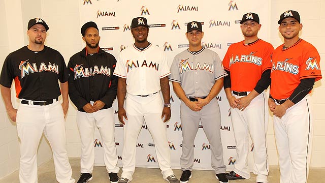
Can we stop trying to copy the U please?
Ok I know that orange is popular because of the Hurricanes and Dolphins but that doesn’t mean you have to wear it to! Just because you’re the Miami Marlins now doesn’t mean you copy the colors of the two other teams in town with orange and coral blue. These jerseys are an eyesore and while at first I thought they were kinda cool that novelty wore off faster than Miami traded away their team this offseason. Maybe the orange is appropriate for the fire sale they’re having on South Beach. I give Miami credit for trying something new but seriously guys when if I have to ask id that is a Marlin on your hat then you probably did it wrong. These jerseys are new but I do think these need to go to. Hey maybe the Marlins will trade their uniforms next!
3) Milwaukee Brewers:
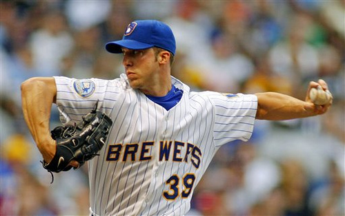
Get the DeLorean! time to go back in time
This is a different one. While the new Brewers uniforms aren’t bad, I’d love to see them go back to their old uniforms full-time. The classic Brewers uniforms are sharp and are perfect with most teams going to “more retro” uniforms. The lighter blue and yellow with the old school block lettering is reminiscent of great baseball uniforms of the past. The Brewers should follow this fashion trend of bringing back vintage looks because it will also bring back one of the most iconic logos in baseball, the glove and ball Brewer logo. While the new uniforms and logo aren’t terrible, I think most of the Brew Crew and their fans would accept these classics once again.
4) New England Patriots:
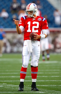
Pat the Patriot needs to replace the Elvis Patriot
Another case of bringing back the old school. Ok Jet fans I know you hate the Patriots like I do, but even you have to admit these are pretty sweet duds. These are patriotic red, white, and blue instead of the current blue and silver color combination the Patriots wear now. These jerseys are bold and colorful and make a statement that this is an American team. Also these uniforms would bring back the fabled Pat the Patriot mascot. Hmmmm do I want a tough and gritty patriot hiking a football in a three-point stance, or the patriot that looks like a cheesy rip off of Elvis. The new uniforms also don’t make sense. I hate there is barely any red and the overuse of silver. Lets make this clear there is only one team that can and should were silver in the NFL and that is the Silver and Black of the Raiders. While I do hate the Patriots seeing them in these uniforms would make them a little easier to stomach when Tom Brady torches your team’s secondary.
5) Tennessee Titans:

old Oilers + new Titans= bad uniforms
These uniforms are trying to do too much. They try to mix a new team and design with the classic colors of the Houston Oilers. The result is a confusing combination of blues and white that just look like they can’t agree. This franchise is trying modernize the old Oilers jerseys instead of creating their own identity. With different shades of blues in different and odd combinations makes these uniforms an eyesore and confusing. On top of that the logo just never seems to fit in especially with all the red when there is no red in the uniforms. I think this is one NFL franchise that should go back to the drawing board and instead of trying to recreate an identity just create their own unique logo and uniforms.
6) San Diego Chargers
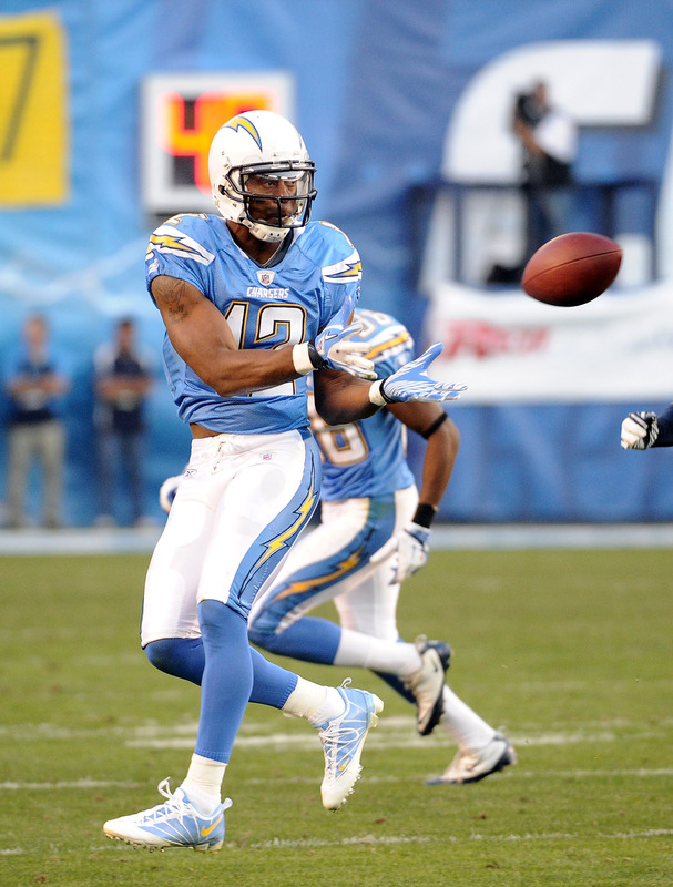
San Diego needs to embrace their best look
Most football fans agree that the Chargers powder blues are one of if not the best uniforms in the game. But here’s my question, why the heck aren’t they wearing them??? These beauties are currently the alternates to the main navy colored jerseys which have been the primary colored jerseys since 1973. Why the Chargers took the best uniform in the game and put it as an alternate I will never know. I am sick of seeing the dark blue charger uniforms and would love to see these babies full-time. The chargers need to embrace their best look because it is the perfect color for San Diego. It’s cool, laid back, and easy-going just like the people of San Diego. Heck if I was the Chargers I would petition the commissioner to wear these uniforms all the time. Can the fans of San Diego petition to make these uniforms the primary home uniforms. I’ll say it again these are my favorite uniforms in the league please wear them!!!
7) Dallas Stars:

Less is more except if your the Stars
Talk about vanilla. While simpler is usually better for Dallas the Stars jerseys are terrible. They took a great jersey in the nineties with the star shape around the bottom of the jerseys and a good logo off their uniforms. Now all that’s left is Dallas, green stripes, and numbers in the front. YYYYAAAAAWWWWWNNNNNN. The Stars need a new uniform and possibly logo. While to logo isn’t bad it could use some upgrading. This is Texas things are supposed to be bigger and better not quieter and simpler. Dallas needs to embrace their inner Texan and get rid of these pathetic jerseys.
8) Anaheim Ducks

The word Ducks across the chest really original
Ah yes the Anaheim Ducks. A franchise notorious for hideous jerseys. While their new third jerseys are an improvement the main jersey with the word “Ducks” across the Chest is boring. Not to mention the gold with black combination which should look cool looks pretty weak. My suggestion is to combine the jerseys and logos of the past. Use the classic duck mask, or Wild Wing logo, with the double hockey sticks that the Mighty Ducks franchise made famous with their Disney movies. Then use this old logo with the new black and orange color schemes. Also if the could combine it with the diagonal stripe of the original jersey, then the Ducks could have one of the best looking jerseys in the game.
9) Carolina Hurricanes:
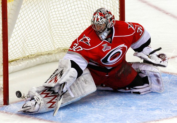
Wow I wish the Whalers were still here
To think this used to be a franchise with one of the best logos and uniforms in hockey. But alas the Whalers are gone and now they are the hurricanes. First off the logo is weak a red and black circle really intimidating. Looks more like a tropical storm then a hurricane. Also the uniforms with red white and blacks fighting with each other makes it a very confusing look. I love the secondary logo on the shoulder and the third jersey. It combines the Carolina triangle, a hockey stick, and a flag in a hurricane to make a simple yet cool logo. The third jerseys that are black with this logo are great and I wish they would switch to these babies full-time and make a white version with it. Those would make the Hurricanes look cool and not like there is a giant red and black eye on their chest.
10) Washington Wizards:

Bullets + Wizards = red, white, and blah
Like the Titans earlier in the list the Wizards have tried to combine two teams into one. Bad idea taking an already weak logo and name and bring to combine it with the historical Bullets jerseys creates this star-spangled screamer. While I do commend them for actually using red white and blue instead of gold and blue the old combination of the old uniforms and logo are just a mess. While these are retro uniforms, sometimes simpler is better. Look at the Nets and Knicks they changed to simpler uniforms and look great. While I think they are going in the right direction, these uniforms are defiantly the elephant in the room, not Republicans, when it comes to the city’s sports teams. While at first they were cool now they need an upgrade. Also the Wizards logo of the wizard and basketball has been weak and outdated for years. This is another team that needs to update their mascot or find a new one. Instead of Wizards rename the team, like in New Orleans, to something more appropriate. Names like Eagles, or Diplomats could be possibilities.
Do you agree with my list? Any teams you think I left out or think I was wrong about? Please feel free to comment below and tell me what you think. Don’t forget to email me or write in the comments section about what you would like me to write about next. Thanks and have a great day!
