Carolina Hurricanes owner Tom Dundon has invested $250 Million into the AAF after reports of the league struggling to meet payroll. While many have been saying this is a bad sign for the league, I talk about how Dundon’s investment shows faith in the upstart league and why the Alliance is like any starting business.
Carolina Hurricanes
Hartford Whalers Special
Since purchasing the Carolina Hurricanes in January, new owner Tom Dundon has embraced the team’s former identity, the Hartford Whalers. On this special episode we’re not only breaking down how the Whalers brand is now being implemented with the Hurricanes after two decades, but also take a look at Hartford’s history. Could a successful resurgence of the Whalers brand mean that the Brass Bonanza could return to Hartford one day? How does an expansion team in Seattle impact Hartford’s NHL future? Why is the Whalers brand still popular and who created one of sport’s greatest logos? Listen to find out.
Five NHL Teams Who Should Update Their Look
- Anaheim Ducks:
 Before they were the Ducks of Anaheim, a little company called Disney owned an NHL team known as the Mighty Ducks. While the team has desperately tried to change their image from the “Mighty” days, the problem is they never found a better logo then their previous incarnation. The webbed duck foot is a decent shoulder logo, but not a stand alone on the chest. The team has really hit it off with their current third uniform which brings back the double hockey stick duck goalie mask logo with a great color combination. The orange, gold, and black could make for three great uniforms, but one thing they should all have in common is the old Mighty Ducks logo with the new color pallet. The logo is too good to waste, and is the team’s best option unless they can come up with a better design.
 - Pittsburgh Penguins:
 The Penguins don’t have a logo problem, it’s a color problem. Their alternate jerseys are beautiful and should become the full-time uniform combo for a few reasons. One, it’s more vibrant and eye catching. Two, it pays tribute to the great Penguins’ teams of the early 90’s. Third, and most importantly it ties time with the rest of the city’s black and yellow color pallet. There’s nothing wrong with their current gold, it just doesn’t match the Steelers and Pirates. It’s time for all the Pittsburgh teams to be on the same page.
 - Carolina Hurricanes:
 The Hurricanes have always had a very generic look with a less then inspiring logo. I’m sorry but if your logo reminds people of swirling toilet water, you have room for improvement. The team should completely change their image and go with the alternate uniform logo and design. The design is different then other teams, but most importantly the alternate logo is a vast improvement. The hurricane storm flag whipping in the wind on a hockey stick is a perfect logo for the team’s namesake, while the background triangle representing the state’s research triangle, is a subtle touch that pays homage to their Carolinas.
 - Phoenix Coyotes:
 The Coyotes have always had an image problem, especially over the past few seasons. Since the team changed their brand, there has been a lot of confusion with uniforms featuring red, tan, and black with a generic looking howling coyote logo. This season the team brought back their 90’s throwbacks, which is a look they should go back to. The red, green, tan, and purple color pallet gave them a definitive look that none in the league could match, and the original coyote logo not only payed tribute to the native american tribes in the state, but was truly one of the most unique logos in NHL history. It’s time for the Coyotes to turn back the clock.
 - Colorado Avalanche:
 The Avalanche hit a home run with their new third uniform logo and design. The simpler design, and look perfectly sums up the team namesake and the city of Denver. While their current “A” logo is good, the main concern with the Avalanche brand is the uniforms. The current home and away set have so much going one with all the piping, design, colors, and odd number fonts. The current alternates a crisp, simple, and feature a great new logo. This is a look that the team should consider making a full-time change.
If it’s broken, it needs fixing: teams that are desperately in need of a makeover
Ah yes fashion, where styles come and go so fast that most people feel way behind. Sports is intriguing because some fashion choices stay eternal. The iconic sweaters and logos of the Original Six in the NHL, the pinstripes of the New York Yankees, the yellow and purple of the L.A. Lakers, and the silver and black of the Raiders. Some teams never need to change their iconic logos and superb jerseys. However, there are some teams that desperately need to update their look. You just look at them and go geez what the heck are they wearing. Here is my list of ten teams that need a makeover.
1) The Phoenix Suns:

I need aloe vera! these jerseys burn my eyes!
Wow I think Willy Wonka let the ompa lompas out. The Suns have never had great uniforms and have gone through many different logos, colors, and uniforms in their history. However, no matter what they do nothing seems to work. I get orange should be incorporated with the uniforms but not as an Orange and Grey eyesore. I know that the Suns have a difficult mascot to work with but I feel that their logo and jersey defiantly is in need of an overhaul. Players look like giant pumpkins isn’t intimidating and I don’t get who the jerseys are so different. Home is white with primarily purple highlights and only a little orange. The road jerseys are all orange and grey with no purple. Guys I understand you want to mix it up but please have a little consistency. I think that the best move for the Suns is to have simpler uniforms without these colors clashing and should try to update their logo. Also pick what colors your going to be and stick with them. If you want to be purple be purple if you want to be orange be orange make up your mind!!!
2) Miami Marlins:
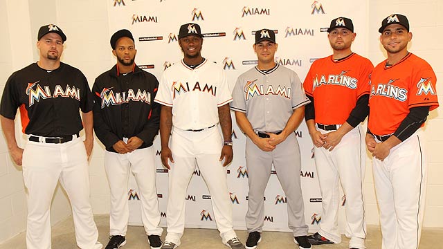
Can we stop trying to copy the U please?
Ok I know that orange is popular because of the Hurricanes and Dolphins but that doesn’t mean you have to wear it to! Just because you’re the Miami Marlins now doesn’t mean you copy the colors of the two other teams in town with orange and coral blue. These jerseys are an eyesore and while at first I thought they were kinda cool that novelty wore off faster than Miami traded away their team this offseason. Maybe the orange is appropriate for the fire sale they’re having on South Beach. I give Miami credit for trying something new but seriously guys when if I have to ask id that is a Marlin on your hat then you probably did it wrong. These jerseys are new but I do think these need to go to. Hey maybe the Marlins will trade their uniforms next!
3) Milwaukee Brewers:
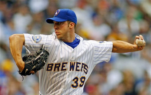
Get the DeLorean! time to go back in time
This is a different one. While the new Brewers uniforms aren’t bad, I’d love to see them go back to their old uniforms full-time. The classic Brewers uniforms are sharp and are perfect with most teams going to “more retro” uniforms. The lighter blue and yellow with the old school block lettering is reminiscent of great baseball uniforms of the past. The Brewers should follow this fashion trend of bringing back vintage looks because it will also bring back one of the most iconic logos in baseball, the glove and ball Brewer logo. While the new uniforms and logo aren’t terrible, I think most of the Brew Crew and their fans would accept these classics once again.
4) New England Patriots:
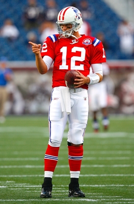
Pat the Patriot needs to replace the Elvis Patriot
Another case of bringing back the old school. Ok Jet fans I know you hate the Patriots like I do, but even you have to admit these are pretty sweet duds. These are patriotic red, white, and blue instead of the current blue and silver color combination the Patriots wear now. These jerseys are bold and colorful and make a statement that this is an American team. Also these uniforms would bring back the fabled Pat the Patriot mascot. Hmmmm do I want a tough and gritty patriot hiking a football in a three-point stance, or the patriot that looks like a cheesy rip off of Elvis. The new uniforms also don’t make sense. I hate there is barely any red and the overuse of silver. Lets make this clear there is only one team that can and should were silver in the NFL and that is the Silver and Black of the Raiders. While I do hate the Patriots seeing them in these uniforms would make them a little easier to stomach when Tom Brady torches your team’s secondary.
5) Tennessee Titans:

old Oilers + new Titans= bad uniforms
These uniforms are trying to do too much. They try to mix a new team and design with the classic colors of the Houston Oilers. The result is a confusing combination of blues and white that just look like they can’t agree. This franchise is trying modernize the old Oilers jerseys instead of creating their own identity. With different shades of blues in different and odd combinations makes these uniforms an eyesore and confusing. On top of that the logo just never seems to fit in especially with all the red when there is no red in the uniforms. I think this is one NFL franchise that should go back to the drawing board and instead of trying to recreate an identity just create their own unique logo and uniforms.
6) San Diego Chargers
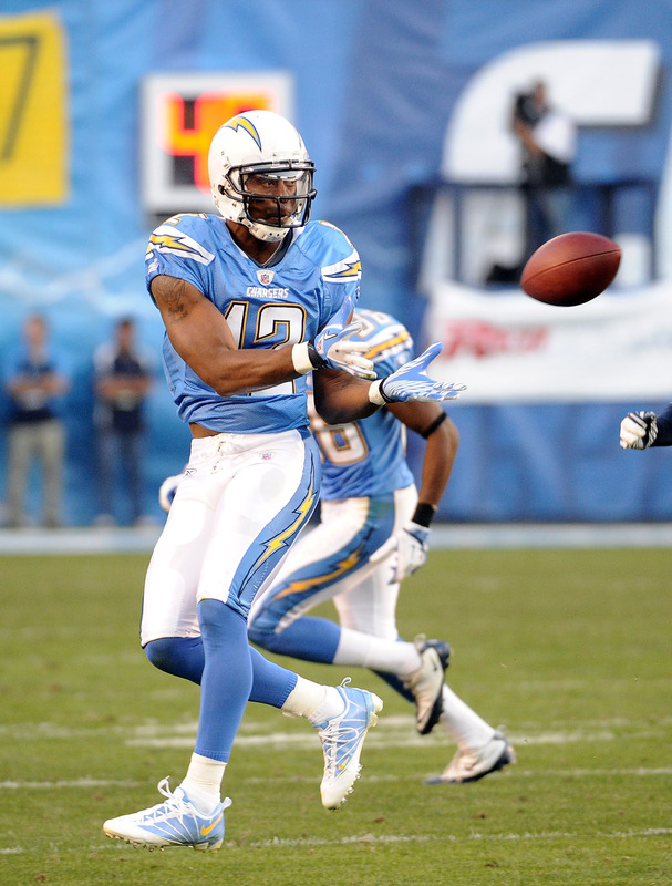
San Diego needs to embrace their best look
Most football fans agree that the Chargers powder blues are one of if not the best uniforms in the game. But here’s my question, why the heck aren’t they wearing them??? These beauties are currently the alternates to the main navy colored jerseys which have been the primary colored jerseys since 1973. Why the Chargers took the best uniform in the game and put it as an alternate I will never know. I am sick of seeing the dark blue charger uniforms and would love to see these babies full-time. The chargers need to embrace their best look because it is the perfect color for San Diego. It’s cool, laid back, and easy-going just like the people of San Diego. Heck if I was the Chargers I would petition the commissioner to wear these uniforms all the time. Can the fans of San Diego petition to make these uniforms the primary home uniforms. I’ll say it again these are my favorite uniforms in the league please wear them!!!
7) Dallas Stars:

Less is more except if your the Stars
Talk about vanilla. While simpler is usually better for Dallas the Stars jerseys are terrible. They took a great jersey in the nineties with the star shape around the bottom of the jerseys and a good logo off their uniforms. Now all that’s left is Dallas, green stripes, and numbers in the front. YYYYAAAAAWWWWWNNNNNN. The Stars need a new uniform and possibly logo. While to logo isn’t bad it could use some upgrading. This is Texas things are supposed to be bigger and better not quieter and simpler. Dallas needs to embrace their inner Texan and get rid of these pathetic jerseys.
8) Anaheim Ducks

The word Ducks across the chest really original
Ah yes the Anaheim Ducks. A franchise notorious for hideous jerseys. While their new third jerseys are an improvement the main jersey with the word “Ducks” across the Chest is boring. Not to mention the gold with black combination which should look cool looks pretty weak. My suggestion is to combine the jerseys and logos of the past. Use the classic duck mask, or Wild Wing logo, with the double hockey sticks that the Mighty Ducks franchise made famous with their Disney movies. Then use this old logo with the new black and orange color schemes. Also if the could combine it with the diagonal stripe of the original jersey, then the Ducks could have one of the best looking jerseys in the game.
9) Carolina Hurricanes:
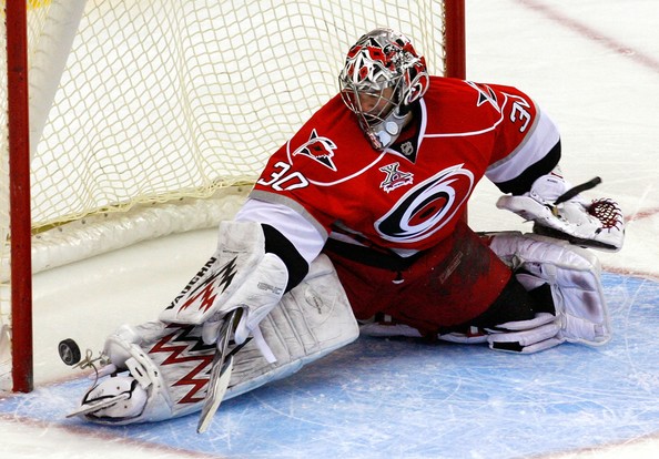
Wow I wish the Whalers were still here
To think this used to be a franchise with one of the best logos and uniforms in hockey. But alas the Whalers are gone and now they are the hurricanes. First off the logo is weak a red and black circle really intimidating. Looks more like a tropical storm then a hurricane. Also the uniforms with red white and blacks fighting with each other makes it a very confusing look. I love the secondary logo on the shoulder and the third jersey. It combines the Carolina triangle, a hockey stick, and a flag in a hurricane to make a simple yet cool logo. The third jerseys that are black with this logo are great and I wish they would switch to these babies full-time and make a white version with it. Those would make the Hurricanes look cool and not like there is a giant red and black eye on their chest.
10) Washington Wizards:

Bullets + Wizards = red, white, and blah
Like the Titans earlier in the list the Wizards have tried to combine two teams into one. Bad idea taking an already weak logo and name and bring to combine it with the historical Bullets jerseys creates this star-spangled screamer. While I do commend them for actually using red white and blue instead of gold and blue the old combination of the old uniforms and logo are just a mess. While these are retro uniforms, sometimes simpler is better. Look at the Nets and Knicks they changed to simpler uniforms and look great. While I think they are going in the right direction, these uniforms are defiantly the elephant in the room, not Republicans, when it comes to the city’s sports teams. While at first they were cool now they need an upgrade. Also the Wizards logo of the wizard and basketball has been weak and outdated for years. This is another team that needs to update their mascot or find a new one. Instead of Wizards rename the team, like in New Orleans, to something more appropriate. Names like Eagles, or Diplomats could be possibilities.
Do you agree with my list? Any teams you think I left out or think I was wrong about? Please feel free to comment below and tell me what you think. Don’t forget to email me or write in the comments section about what you would like me to write about next. Thanks and have a great day!
Bring back the Brass Bonanza!!!!! How Connecticut can get an NHL team back and why they need to
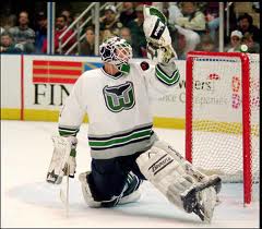
Hartford has been without hockey since 1997
April 13, 1997 is a date that probably doesn’t mean much to you. Just another day that passed on the calendar without anything significant occurring. However, this was a day that would live in Connecticut infamy. After defeating the Tampa Bay Lightning by a score of 2-1 the Hartford Whalers where history. These Whalers were just another casualty in a decade filled with more shuffling of NHL franchises then a card game at the casino. Hartford joined the likes of Quebec, Minnesota, and Winnipeg as cities that lost their beloved franchises to other cities. While hockey has returned to Minnesota and most recently Winnipeg, the fans of the Brass Bonanza are still awaiting for the Whalers to come home.
I guess you could say that the Whalers were just in the wrong place at the wrong time. Victims of a new owner, who never intended on keeping the franchise in Hartford. A state whose Governor who was trying to lure the New England Patriots from Foxboro down to the insurance capital of America. Governor Rowland felt it was more important to try to lure a different team to the state instead of keeping the one it already had. Long story short, the Whalers were moved to Carolina, while Robert Kraft stabbed the whole state in the back when it was revealed that he just used the relocation to Connecticut as a ploy in order to gain leverage to build Gillette stadium in Foxboro. Now you know why Connecticut doesn’t have that many Patriots fans.
With the current state of the NHL with teams like Phoenix, New Jersey, Florida, and Dallas struggling to fill their arenas, the next great migration of teams moving might have just commenced. We may look back and say this movement was started by the Thrashers moving to Winnipeg. The biggest knock on Connecticut is the lack of an NHL arena. The current arena, the XL center, is old and incredibly outdated. A new downtown arena is essential for not just hockey, but for the well-being of the city. A city that desperately needs to revitalize its downtown community.

It’s an uphill battle but with the right course of action hockey could be back
The UCONN Huskies are without a doubt the biggest draw in Connecticut. No surprise there, with multiple National Championships the Huskies are a National power that gives us Nutmegers a sense of pride. With the UCONN hockey team entering the fold in 2014 couple with the declining XL center, it’s not if but when a new arena should be built. The goal of this new arena would not be to just bring in an NHL franchise but rather give UCONN a state of the art arena for years to come. This new arena would bring in more events such as NCAA regional tournaments while bringing money to a state that is cash strapped. Not to mention it could be a major tool to recruit top talent in order for UCONN to continue their dominance on the hardwood. The success of the MTS Centre in Winnipeg proves the arena wouldn’t have to be a colossal arena. A 15,000 seat arena would be a perfect size for both collegiate and professional teams to fill the seats.
While there are many other roadblocks preventing the Whalers homecoming, such as current teams affairs and television contracts, step one is to build a new arena. Remember Field of Dreams? If you build it they will come ! Money is a big issue with financing this arena but if the state realizes the benefits of the UCONN Huskies athletic programs it makes sense. Sure the ultimate goal is to bring in an NHL team, but it’s a process. The Whalers had one of the most loyal fan bases and left not because of poor fan attendance but because of a miser owner and a governor who gambled on the NFL and lost. Connecticut needs to improve its sports infrastructure for its college basketball

Whalers fans still miss their beloved team
teams. If they build an arena to help UCONN, then the pipe dream of NHL hockey could become a reality. Hartford was the Green Bay of the NHL in America and represented the unique passion and love that New Englanders have for the game. The NHL experiment in the Southern U.S. has had mixed to terrible results. Now maybe the best time for Gary Bettman to look north, where hockey belongs. With the success of the Whalers winter festival at Rentschler field over a year ago proved that their still is a strong fan base. While critics argue that minor league attendance has been poor in Hartford minor league hockey to the people of this great state is like beer without alcohol. Once you’ve had the real thing anything less won’t suffice. When the minor league team changed its named to the CT Whale instead of the Wolf Pack season ticket sales increased by 36%. Coincidence? I think not!!!
The Whalers have such a great history and arguably one of the greatest sports logos in history. What I’m saying is that the city of Hartford has the chance to kill two birds with one stone. Not only improve the playing arena for the UCONN Hockey and basketball teams but at least give the state a chance to get a NHL team back. The road ahead is without question going to be a long and hard one to get the NHL back. But if Hartford takes that first step by investing in UCONN, the state’s best asset who knows? Maybe the sounds of the brass bonanza will echo through downtown Hartford once again. Please fell free to comment and follow my blog. I would love to hear what suggestions you have for me and what you would like me to write about. You a Whalers fan? Would love to hear from you! Like the Whalers? click these links below Thanks !!
